Optimize Onboarding Screens: Boost Retention
Build effective onboarding screens to boost retention. Discover 2026 best practices, patterns, metrics, and implementation for iOS, Android & cross-platform.
A weak onboarding flow doesn't just annoy new users. It cuts directly into retention. Apps with a good onboarding experience achieve a 50% higher retention rate, and 74% of potential customers will switch to a competitor if the process is too complicated, according to Akita's roundup of customer onboarding statistics.
That changes how mobile teams should think about onboarding screens. They aren't decorative intro slides. They're the first operational layer of product strategy, growth, and trust. For iOS, Android, React Native, Flutter, Unity, and Unreal teams, the challenge isn't only deciding what to show. It's deciding what to ship locally, what to control remotely, what to personalize, and what to test without turning each iteration into another release-cycle project.
Why Onboarding Screens Define App Success
Modern onboarding screens sit at the boundary between user intent and product reality. A user arrives with a job to do, limited patience, and incomplete context. Your app responds with messaging, choices, permissions, setup, and the first path to value.
If those screens are clear, users feel momentum. If they're cluttered, users feel work.
The most common mistake is treating onboarding as a short tutorial. In practice, onboarding screens do several jobs at once:
- Explain value fast: What is this app for, and why should the user care now?
- Reduce uncertainty: Is this safe, legitimate, and worth my time?
- Guide the first action: What should I do first?
- Shape future journeys: Which path should this user see next?
That last point matters more than many teams realize. In mobile apps and games, onboarding isn't separate from monetization, retention, feature adoption, or liveops. It influences all of them. A streaming app may use onboarding screens to tune content recommendations. A fintech app may use them to stage compliance steps. A multiplayer game may use them to move players toward the first session loop before surfacing store offers or social prompts.
Practical rule: If a screen doesn't help users understand value, complete required setup, or reach a meaningful first action, it probably doesn't belong in onboarding.
Good onboarding is also platform-sensitive. Native iOS and Android apps can rely more heavily on system conventions, gestures, and permission timing. Cross-platform teams need tighter discipline because visual and behavioral mismatches show up quickly, especially when a single flow spans native screens, embedded game scenes, and remote-configured UI.
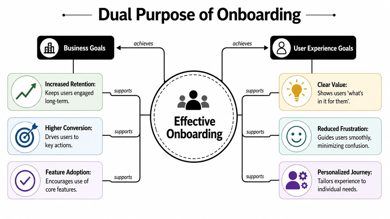
Aligning Business and User Experience Goals
Teams often split into camps during onboarding reviews. Growth wants conversion. Product wants activation. Design wants clarity. Engineering wants something maintainable. Support wants fewer confused tickets.
Those aren't competing goals when the flow is designed well. They're the same system viewed from different angles.
Business goals need a fast path to value
From a business perspective, onboarding screens should improve the quality of the user base that enters the core product. That means moving users toward actions that predict retention, purchase intent, subscription readiness, or repeat play.
For a news app, that may be selecting topics and enabling alerts later. For a fitness app, it may be choosing a goal and completing the first workout. For a game, it may be finishing the first playable loop before introducing progression systems, shop surfaces, or battle pass messaging. For subscription apps, paywalls can be part of this system, but they should appear in the right sequence and with context.
A useful mental model is a hotel concierge. A good concierge doesn't hand every guest the same script. They identify why the guest arrived, remove friction, and direct them to the next best action. Onboarding screens should work the same way.
Teams that care about long-term retention usually find that onboarding quality and retention quality are tightly linked. The work doesn't stop at the first session, which is why it's worth pairing onboarding decisions with a broader mobile app retention strategy.
User experience goals aren't softer goals
Users don't experience "business logic." They experience confusion, effort, confidence, and progress. That's why the UX side of onboarding has to be explicit.
A strong onboarding flow usually does three things well:
- It shows what's in it for the user before asking for too much.
- It limits cognitive load by keeping each step focused.
- It creates confidence through clear choices and immediate feedback.
The best onboarding screens feel less like instructions and more like guided momentum.
When teams miss this, they usually over-collect information. They ask too many setup questions, front-load permissions, or push account creation before the user understands the product. That may satisfy a short-term internal requirement, but it usually lowers trust and slows activation.
A better standard is simple. Every onboarding decision should answer two questions:
| Question | Strong answer |
|---|---|
| Does this help the business? | It moves the user toward a meaningful action, segment, subscription path, or retained habit. |
| Does this help the user? | It reduces confusion, speeds setup, or makes the product immediately more useful. |
If a step only serves one side, revisit it.
Choosing the Right Onboarding Pattern
Pattern choice matters more than visual style. Teams spend too much time debating whether onboarding screens should feel sleek, playful, or premium, and not enough time asking whether the underlying pattern fits the product.
The biggest trap is defaulting to the multi-screen carousel because it's easy to design and familiar to stakeholders. In practice, it often performs poorly.
Stop defaulting to carousel tours
More than 70% of mobile users skip or disengage from multi-step onboarding carousels, while a 60 to 90 second optional vertical video explaining the app's value can significantly boost activation, according to Appcues' analysis of onboarding UI and UX patterns.
That doesn't mean carousels are always wrong. It means they should no longer be the default.
An optional explainer can help here, especially when a product is visual, behavior-driven, or category-new for the user.
Compare patterns by product reality
Here's the decision framework I use with mobile and game teams:
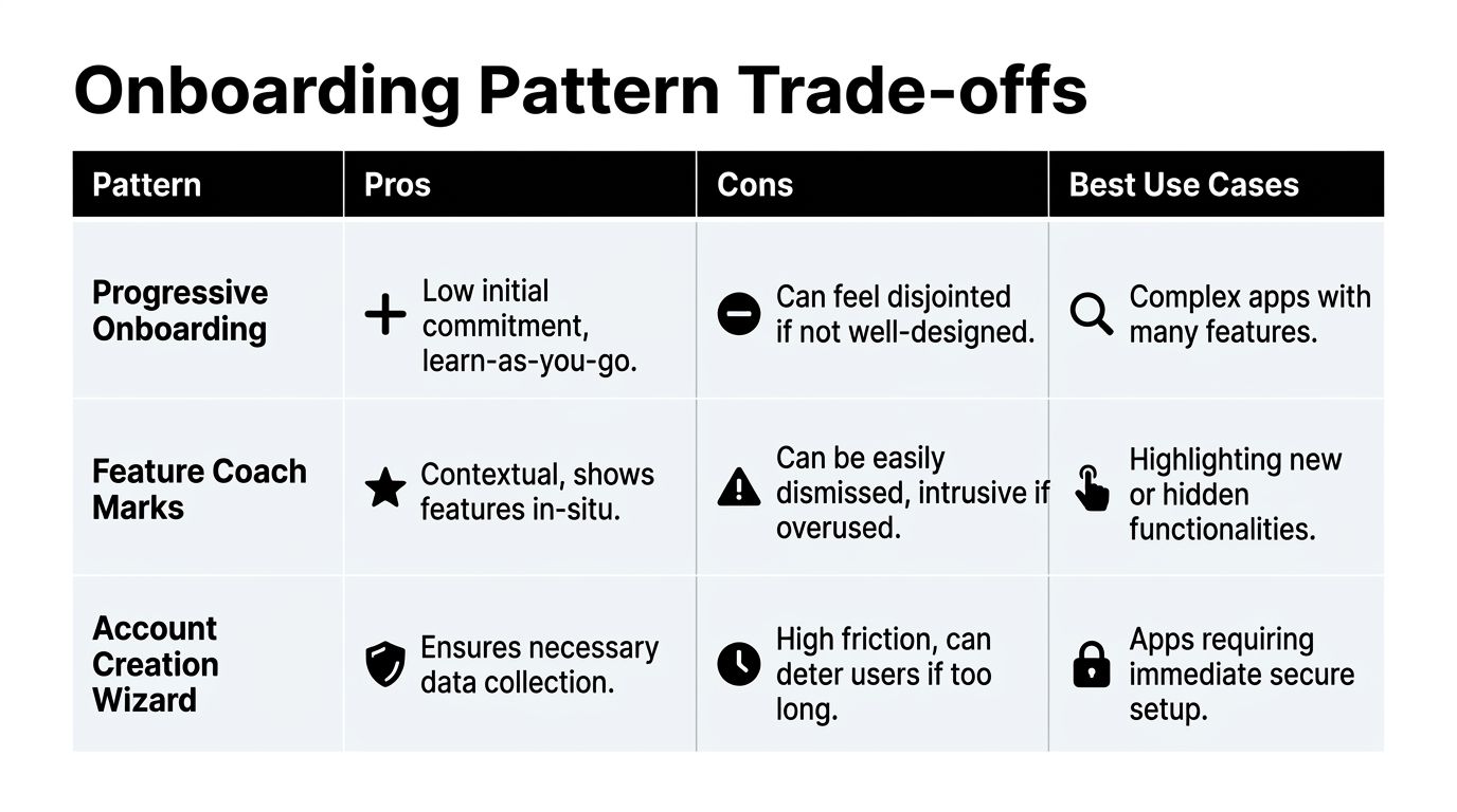
| Pattern | Best when | Strength | Risk |
|---|---|---|---|
| Benefit carousel | Brand-new categories or simple consumer apps | Quick value framing | Users swipe through without learning anything |
| Optional video intro | Visual products, creator tools, games, utility apps with unfamiliar workflows | Faster comprehension with low interaction cost | Bad scripts or overlong videos create passive drop-off |
| Interactive first-task tutorial | Products with one obvious core action | Gets users to doing, not reading | Can feel rigid if users want to explore |
| Progressive disclosure | Complex products with multiple features | Keeps the first session light | Needs disciplined trigger logic later |
| Account creation wizard | Regulated, collaborative, or secure apps | Captures required data cleanly | High friction if used before value is clear |
| Personalization quiz | Apps where setup changes content, goals, or progression | Makes the home state immediately relevant | Feels manipulative if answers don't affect the product |
A few examples make the trade-offs clearer.
What works by app type
For a meditation app, a quiet value screen plus one or two personalization prompts can work well. The user expects guidance and a personalized experience.
For a sports tracker, an interactive flow is stronger. Asking users to record or simulate a first activity teaches more than a three-card carousel.
For a mobile strategy game, the first session usually needs a controlled playable tutorial. But that doesn't mean every system needs explanation up front. Teach movement and the core loop first. Hold economy systems, guilds, battle pass prompts, and premium currency education until the player has context.
For productivity or SaaS apps on mobile, a blank state plus checklist often outperforms a front-loaded tour. Users want to do something concrete, not memorize the feature map.
If the product is learned by doing, onboarding should be action-led. If the product is learned by seeing, an optional video or visual preview often works better.
Choose the pattern your stack can support
At this point, implementation realities matter.
- Native iOS and Android: Best when you need precise platform behaviors, animation fidelity, and tight control over system interactions.
- React Native and Flutter: Good for shared logic and shared UI systems, but onboarding components still need careful QA around performance, gesture handling, keyboard behavior, and native prompt timing.
- Unity and Unreal: Strong when onboarding is part of game flow or 3D interaction. Harder when teams bolt standard app UI patterns onto scenes without strong tooling for experiments and remote updates.
The pattern isn't just a UX choice. It's a production choice. Pick one your team can evolve, instrument, and test without turning each copy change into engineering debt.
Designing Onboarding Screens That Convert
Execution is where good onboarding patterns get ruined. Teams choose a sensible structure, then overload the screens, muddy the copy, or hide the exit.
The most reliable improvements usually come from subtraction.
Keep each screen narrow
Each onboarding screen should do one job. Not three.
If a screen tries to explain the value proposition, ask for profile data, and request notifications, users won't know what matters. Split those responsibilities. On mobile, clarity comes from single-purpose screens with strong hierarchy and obvious next actions.
A practical checklist:
- One core action: Every screen should answer, "What should the user do here?"
- One message hierarchy: Headline first, supporting copy second, controls third.
- One decision point: Avoid stacked asks like "continue," "connect contacts," and "start trial" on the same view.
Write copy for decisions, not brand theater
A lot of onboarding copy sounds polished and says nothing. Users don't need slogans in the first session. They need orientation.
Use copy that explains the benefit of the next step in plain language. "Choose your goals" is better than "Personalize your journey" when the product is practical. In games, copy should teach state, reward, and next action. In utilities, it should explain why the user is being asked for something now.
A useful standard is this: if the user screenshots the screen and sends it to a friend, the friend should understand why that screen exists.
"Tell users what happens next, not what your brand believes."
For teams tuning trial starts, upgrade prompts, and paywall sequencing, a lot of the same discipline applies to onboarding copy and screen hierarchy. This is the same craft behind good conversion rate optimization practices for mobile experiences.
Build escape hatches and visible progress
Users should never feel trapped in onboarding.
Include:
- A visible skip option: If a step isn't required, let users defer it.
- Progress feedback: Dots, step labels, or checklist state can reduce uncertainty.
- Safe reversibility: Let users go back and edit choices when those choices shape recommendations or setup.
Micro-interactions help too, especially when they reinforce progress or success. Rive-powered animations, subtle confirmation states, and responsive transitions can make a flow feel intentional without turning it into a showpiece. The key is restraint. Motion should support comprehension, not compete with it.
Building and Testing Onboarding Flows
Hard-coded onboarding flows create a familiar bottleneck. Product wants to change copy, reorder steps, test a different quiz, suppress a paywall for one cohort, or add a feature announcement after activation. Engineering says the next app release is already full. QA asks how many combinations now need testing. The idea gets delayed or cut.
That's still how a lot of teams operate. It doesn't scale.
The old model breaks under iteration pressure
A static onboarding implementation usually means:
- onboarding screens live inside app code
- experiments require developer time
- copy and layout changes wait for release trains
- each platform drifts over time
- growth, product, and design teams depend on engineering for every adjustment
This hurts even more in cross-platform stacks. React Native can cover iOS, Android, and web through react-native-web, but support can feel less unified than native development, which still delivers the highest platform fidelity with native animations, system fonts, and gestures users expect, as discussed in Mobisoft's comparison of cross-platform and native approaches. Unity-based apps add another layer. For more complex integrations, Unity as a Library lets teams bundle Unity inside native iOS and Android apps, with native files placed directly in the Plugins folder under Assets and support tied to Xcode 9.4, Android Studio 3.4.2, and Unity LTS 2019.4 or 2020.1, as shown in Unity's Unity as a Library walkthrough.
That mix is manageable, but not if every onboarding change is hand-implemented per client.
The modern model separates experience from release cycles
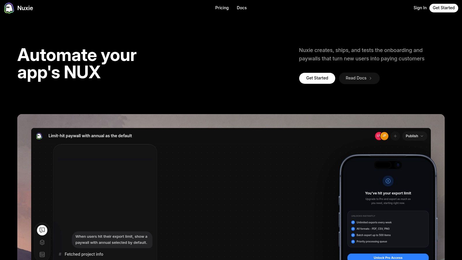
A better setup uses remote configuration plus a visual flow layer. Product and growth teams define the onboarding logic, screen order, targeting, and experiments outside the core app binary. Engineering integrates the runtime once, then focuses on data quality, guardrails, rendering fidelity, and native edge cases.
That changes the operating model in useful ways:
| Old way | Better way |
|---|---|
| Screen changes require app releases | Many changes ship remotely |
| Every experiment needs engineering bandwidth | Teams can run controlled tests with lighter engineering involvement |
| Platform variants drift over time | Shared logic keeps flows aligned |
| Analytics are added after the fact | Events and outcomes are defined as part of the flow |
This matters for more than onboarding. The same capability usually powers surveys, upgrade prompts, feature announcements, retention offers, game liveops moments, and paywalls. Paywalls are one important use case, not the whole stack.
Build for cross-platform consistency, not fake uniformity
Cross-platform teams shouldn't aim for identical onboarding on every platform. They should aim for consistent intent with platform-appropriate execution.
That usually means:
- shared decision logic across iOS, Android, React Native, Flutter, Unity, and Unreal
- local rendering where native conventions matter
- remote targeting for cohort-specific flows
- event instrumentation that maps to the same funnel definitions everywhere
For game teams, this is especially useful when onboarding spans menus, modal UI, mission prompts, economy messaging, and entitlements. Unity remains a game engine first, but it can also support cross-platform mobile app experiences and is often grouped with React Native and Flutter as a notable cross-platform development tool in Redwerk's overview of mobile development tools. The implementation burden still rises quickly when non-game UX gets mixed into game runtime without a clear orchestration layer.
Native fidelity still matters. Shared tooling doesn't remove platform nuance. It gives teams a cleaner place to manage logic, sequencing, analytics, and experiments.
What a solid experimentation workflow looks like
A practical onboarding workflow looks like this:
- Define the activation event
Pick the first action that represents real value. - Map the current funnel
Instrument every onboarding step and exit. - Form one hypothesis at a time
Example: remove a screen, defer signup, replace a carousel with video, reorder the paywall, or split one audience into two paths. - Ship remotely where possible
Preserve engineering time for runtime quality, native integrations, and event correctness. - Review by segment
New paid users, organic users, returning reinstallers, subscribers, and high-intent game players often behave differently.
If the team is serious about improving onboarding, it also needs a reliable mobile testing loop. That's where structured A/B testing for mobile apps becomes operational rather than occasional.
Key Metrics and Mistakes to Avoid
A lot of onboarding reporting is still too shallow. Teams look at completion rate, maybe install-to-signup, and stop there. That hides where the primary friction sits.
The baseline problem is already severe. Only 37.5% of new SaaS users successfully complete onboarding. 72% of users abandon an app during onboarding if it requires too many steps, and every extra minute added to the flow reduces trial-to-paid conversion by about 3%, according to SundaySky's customer onboarding statistics.
Measure what changes decisions
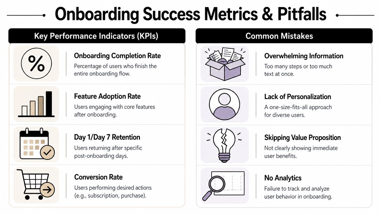
Four metrics matter most in practice:
- Onboarding completion rate: Useful, but only if the flow itself is worth completing.
- Drop-off by screen: Design and implementation teams pinpoint actual friction.
- Time to value: How long it takes users to reach the first meaningful action.
- Post-onboarding outcomes: Day 1 retention, Day 7 retention, feature adoption, and conversion behavior.
Completion without activation is a vanity result. Users can finish the flow and still leave with no understanding of the product.
A small tracking matrix helps keep teams honest:
| Metric | What it tells you | Common misuse |
|---|---|---|
| Completion rate | Whether users finish the sequence | Treating completion as the final goal |
| Screen drop-off | Where friction clusters | Looking only at aggregate totals |
| Time to value | Whether the flow is too slow | Ignoring differences by segment |
| Retention and conversion after onboarding | Whether onboarding created durable value | Attributing all downstream change to onboarding alone |
The mistakes that repeatedly damage results
These show up in nearly every audit:
Asking too early
Permission prompts, registration, card capture, and subscription decisions appear before the user has context. This creates distrust and delays the first win.
Using one path for everyone
A first-time player, a reinstalling subscriber, and a paid-acquisition user shouldn't always see the same onboarding screens. Different intent deserves different sequencing.
Explaining instead of guiding
Teams write long educational copy when the product could simply stage a first action. This is common in productivity apps and mobile games with layered economies.
Ignoring instrumentation gaps
If you can't tell which screen caused the drop-off, you don't have an optimization problem yet. You have a measurement problem.
Most onboarding failures aren't creative failures. They're sequencing failures.
Treating onboarding as done
Products evolve. Feature mix changes. Pricing changes. New channels bring different users. Onboarding has to keep changing with them.
The Future of User Onboarding
The best teams no longer treat onboarding screens as a fixed welcome sequence. They treat them as a dynamic system that adapts to user intent, product complexity, and downstream business goals.
That shift is already visible across mobile apps and games. Static tours are losing ground to contextual guidance, optional media, remote-configured flows, and faster experimentation. Cross-platform teams are also getting more disciplined about separating shared logic from platform-specific presentation, which matters across iOS, Android, React Native, Flutter, Unity, and Unreal.
The next step is more personalized and more automated. AI-native tooling is pushing onboarding toward real-time segmentation, adaptive sequencing, and faster detection of friction patterns that teams would otherwise find too late. That doesn't remove the need for product judgment. It raises the bar for it.
Good onboarding screens still come down to a few fundamentals. Show value early. Ask only what's necessary. Match the pattern to the product. Instrument every step. Test the parts that matter.
The difference now is that teams can treat onboarding as a living part of the product, not a one-time launch asset.
Nuxie brings that operating model into one place. It gives mobile app and game teams an AI-native platform for in-app experiences, experimentation, analytics, billing, entitlement sync, and growth workflows across iOS, Android, React Native, Flutter, Unity, and Unreal. Teams can use Nuxie to build and remotely ship onboarding screens, surveys, feature announcements, retention offers, liveops moments, and paywalls without tying every change to an app release. It's provider-agnostic, works alongside existing tools, and doesn't charge a revenue-share fee for billing or entitlement data.