
Boost App Growth: Mobile App Engagement Metrics 2026
Guide to mobile app engagement metrics for product & growth teams. Measure, analyze & improve DAU/MAU, retention, stickiness with actionable formulas.
Your dashboard says the app is healthy. DAU is climbing. Session counts look strong. People are opening the app often enough that nobody in the weekly review wants to sound alarmist.
Then revenue stalls, trial conversions wobble, or players keep returning without progressing. That's the moment they realize they aren't missing data. They're missing a workflow.
The hard part with mobile app engagement metrics isn't deciding which chart to pin. It's making each metric survive the full trip from instrumentation to validation to experiment design to in-app action. If your event taxonomy is sloppy, your retention chart lies. If your retention chart is right but disconnected from product changes, it becomes a scorecard instead of a growth tool. If your experiment reads “engagement up” but users still don't subscribe, buy, finish, or progress, you optimized motion instead of value.
I've seen this pattern across utility apps, subscription products, and games. Teams over-focus on activity because activity is easy to count. What matters is whether that activity maps to success events that reflect user value and business value at the same time.
That's why the best teams treat metrics as operating inputs. They instrument carefully on iOS, Android, React Native, Flutter, Unity, and Unreal. They validate event integrity before trusting a dashboard. They segment aggressively. They run experiments against real bottlenecks. They use in-app surfaces like onboarding steps, feature callouts, liveops moments, and paywalls to respond quickly without rebuilding the app every week.
Introduction From Data Overload to Actionable Insight
A familiar mobile growth meeting goes like this. Product highlights that DAU is up. Engineering reports that app stability looks fine. Marketing says installs are holding. Someone asks why subscription starts, purchases, or repeat value aren't following the same pattern. The room goes quiet because every team is looking at a different truth.
That disconnect usually comes from one mistake. Teams track too many metrics in isolation and too few metrics in sequence.
A metric only becomes useful when you can answer four questions:
- What exactly produced it
- Why it moved
- Which user segment changed
- What in-app action should follow
Without that chain, mobile app engagement metrics become decorative. DAU rising can mean habit formation, or it can mean users repeatedly checking a stuck order. Longer sessions can mean deeper immersion in a game, or confusion on a broken checkout. High launch frequency can look healthy right up until you realize users are bouncing before they do anything valuable.
Practical rule: Never review an engagement metric without a paired success event.
For a finance app, the paired event might be account funding or transfer completion. For a media app, it might be content completion. For a game, it might be level progression, match completion, or store purchase. For a subscription product, it might be trial start, paywall conversion, renewal intent, or feature activation.
Once teams adopt that mindset, the dashboard changes from a wall of charts into a decision system. You stop asking, “Are people active?” and start asking, “Which behaviors predict retention, conversion, and long-term value for this product type?”
That's the shift that matters. Not more reporting. Better loops.
The Foundational Four Engagement Metrics You Must Track
Four metrics carry most of the load in an engagement review: stickiness, retention, session behavior, and churn. If the team cannot define these events, time windows, and denominators the same way, every A/B test result is harder to trust.
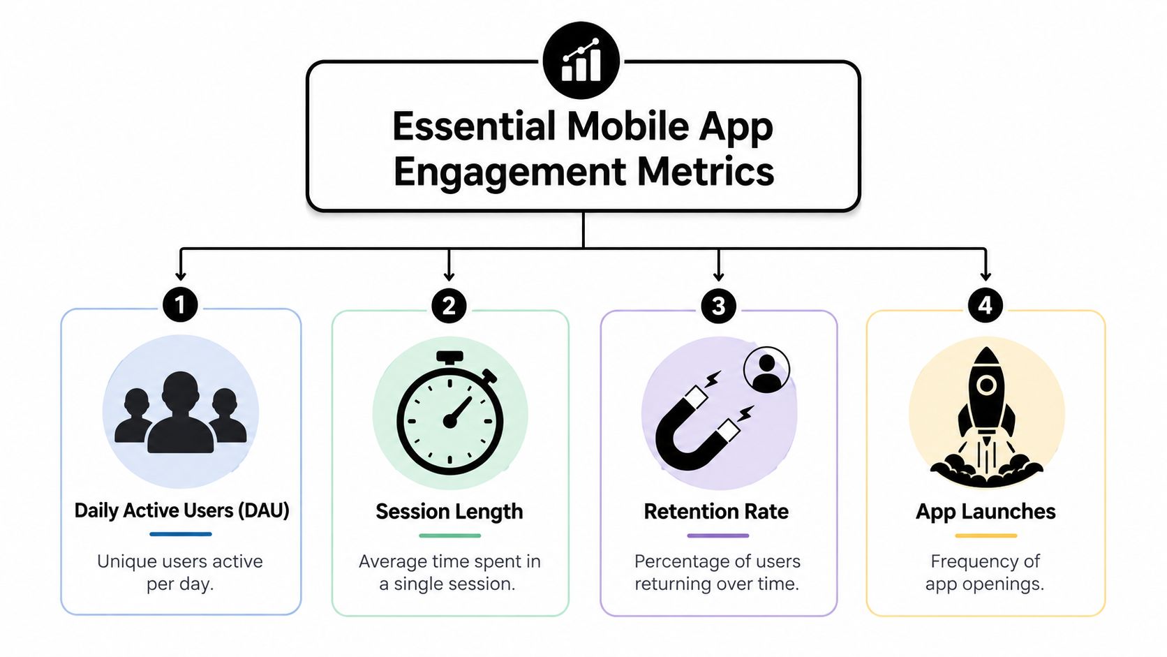
What makes these four useful is not the dashboard itself. It is the full metric lifecycle. Instrument the event correctly, validate that it matches real behavior, segment it by cohort, then use it to design a product change and measure whether that change improved business outcomes. That discipline also helps catch ghost engagement, where users open the app often but create little value.
DAU MAU and stickiness
DAU is unique daily active users. MAU is unique monthly active users. The ratio between them is the quickest read on product habit.
Formula
DAU/MAU ratio = DAU ÷ MAU × 100
Example:
- DAU = 2,500
- MAU = 10,000
- Stickiness = 2,500 ÷ 10,000 × 100 = 25%
A 25% ratio means one quarter of your monthly active base used the app on a given day. That is a useful pattern for products that should earn repeated usage. It is much less useful on its own for products with naturally infrequent intent, such as tax filing, travel booking, or insurance claims.
Benchmarks help only if the product cadence matches. According to Userpilot's 2025 guide to mobile app metrics, 20% or higher indicates strong stickiness, and above 25% indicates excellent engagement. Braze's 2024 article on essential mobile app metrics formulas says 20% or higher is widely considered healthy for consumer apps, while top-tier engagement platforms often exceed 50%.
In practice, I treat stickiness as an early warning metric, not a win condition. If DAU/MAU rises after a release, check what users did. Did they complete a transfer, finish a workout, watch content, place an order, or send a message? Or did they reopen the app three times because push notifications were noisy and the core task still failed?
That is how you avoid ghost engagement. Pair stickiness with a value event rate such as:
- DAU with purchase completion
- DAU with content completion
- DAU with message sent
- DAU with booking confirmed
If stickiness rises and the paired success event does not, the product is generating activity, not progress.
Retention rate
Retention measures whether users return after their first experience. It is one of the best checks on whether the app delivered enough value to earn another session.
The standard checkpoints are Day 1, Day 7, and Day 30 because they map to different questions. Day 1 tests the first-use experience. Day 7 tests whether people found a reason to come back in the first week. Day 30 tests whether the product remained useful long enough to matter.
Formula
Retention rate = Users who return during the target period ÷ Users in the original cohort × 100
Example:
- 4,000 users installed on May 1
- 1,200 of that same cohort opened the app again on Day 7
- Day 7 retention = 1,200 ÷ 4,000 × 100 = 30%
The word cohort matters. A retention chart mixed across paid users, organic users, Android users, iOS users, and users who saw different onboarding flows gives you an average that hides the cause. Cohort-based retention gives the product team something testable.
| Metric | What it answers | Common use |
|---|---|---|
| Day 1 retention | Did first-use experience land? | Onboarding quality |
| Day 7 retention | Did the app create repeat value? | Early habit formation |
| Day 30 retention | Is there sustained usefulness? | Product-market fit signal |
Retention also forces cleaner instrumentation. If the install event fires twice, or if a background app open counts as a return, the metric is wrong before the analysis starts. Validate the cohort entry event first. Then validate the return event. Only then use retention as the primary metric in an onboarding or activation test.
Session length and frequency
Session metrics explain usage rhythm, but they are easy to misuse.
Average session length measures how long a session lasts. Session frequency measures how often users start sessions within a defined period. Teams often assume more time and more sessions are better. That is true for some products and completely wrong for others.
A delivery app should help users complete a task quickly. Longer sessions can point to friction in search, address entry, or payment. A media app may want longer sessions because viewing time often correlates with ad revenue or subscription value. A game may care about both length and frequency, but only if those sessions include progression, economy activity, or social play.
Use the math, but keep the interpretation grounded in product intent.
Formula
Average session length = Total session time ÷ Total number of sessions
Session frequency = Total sessions in period ÷ Total active users in period
Example:
- 50,000 total session minutes in a week
- 20,000 sessions
- Average session length = 50,000 ÷ 20,000 = 2.5 minutes
And:
- 20,000 sessions in a week
- 5,000 active users
- Session frequency = 20,000 ÷ 5,000 = 4 sessions per user per week
Those numbers only become useful when paired with an outcome. A shorter average session after a checkout redesign can be a win if order completion rises. Higher session frequency after a notification test can be a loss if users open, hesitate, and leave without doing anything valuable.
A strong review pattern is simple:
- Utility app: session frequency + task completion rate
- Subscription app: session length + feature activation or trial conversion
- Game: session frequency + level completion, PvP participation, or purchase rate
A quick explainer is useful before the video below.
Churn rate
Churn is the drop-off side of engagement. It shows how many users stopped coming back within the window you define.
Formula
Churn rate = Users lost during the period ÷ Users at the start of the period × 100
Example:
- 8,000 active users at the start of the month
- 1,600 met your churn definition by month end
- Churn rate = 1,600 ÷ 8,000 × 100 = 20%
The trap is the phrase users lost. That definition changes by product. A daily habit app might classify seven days of inactivity as churn. A travel app might need a much longer window. If the window does not match actual usage cadence, churn becomes noise.
Churn becomes useful when you connect it to the last meaningful behavior before the user disappeared. That is where product and engineering teams can act.
Look at:
- Last successful event before churn
- Last screen before churn
- Last app version before churn
- Last campaign or acquisition source before churn
That analysis turns a lagging metric into a diagnosis. If churn spikes after a release, inspect crash rates and the final screen path. If churn concentrates among users acquired from one campaign, review message match and onboarding intent. If churn rises after a push program starts, check whether session frequency went up while value events stayed flat. That pattern usually signals ghost engagement, not growth.
Beyond the Basics Advanced and Contextual Metrics
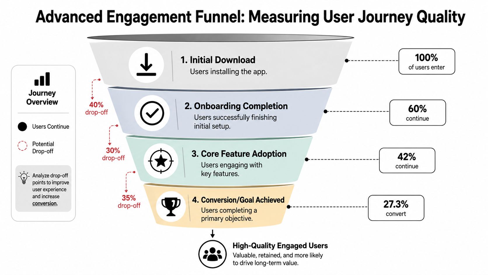
The next layer isn't about more dashboards. It's about determining whether engagement is valuable.
Time to first key action
A new user doesn't care about your full feature map. They care about reaching the first moment of value.
That's why time to first key action is one of the most practical advanced metrics you can define. The key action should represent the first credible proof that the app will be useful. In a budgeting app that might be linking an account. In a language app it might be finishing the first lesson. In a game it might be completing the tutorial and entering the live economy.
You can calculate it as the elapsed time between install or first open and the first value event. The exact unit can vary by product. What matters is consistency.
This metric is especially useful when onboarding gets bloated. Teams tend to add preference steps, permission prompts, profile setup, and intro screens. Time to first key action shows whether all that ceremony is helping or delaying value.
Funnel conversion rates
Funnels answer a different question than retention. Retention says users came back. A funnel says whether they progressed.
A few examples:
- Onboarding funnel: install → account created → onboarding complete → first key action
- Monetization funnel: paywall viewed → product selected → purchase started → purchase completed
- Game progression funnel: tutorial started → tutorial completed → first level complete → first store interaction
When a funnel breaks, raw engagement metrics won't tell you where. Funnel conversion will.
Here's a practical framing:
| Funnel stage | What to inspect | Typical failure mode |
|---|---|---|
| Entry | Trigger timing | Prompt appears before value is clear |
| Mid-step | UX friction | Too many taps, weak copy, broken state |
| Commit step | Technical handoff | Billing, entitlement, auth, save failure |
| Post-complete | Follow-through | User finishes but doesn't understand next step |
Feature adoption and engagement quality
Feature adoption matters because many teams ship new surfaces that never become part of the user routine. A feature exists in release notes but not in behavior.
Don't just ask, “Did users touch it?” Ask:
- Did the right segment use it
- Did use repeat
- Did it change retention, conversion, or progression
- Did it reduce drop-off in a critical journey
The idea of engagement quality is essential. AppMakers's article on mobile app engagement metrics and strategies makes an important point: high session frequency without correlated event completion indicates “ghost engagement,” and without linking frequency to conversion events or task completion, teams can't distinguish anxious engagement from valuable engagement.
That distinction shows up everywhere:
- A commerce user opens the app repeatedly to check a delayed order
- A player keeps returning because a progression gate is unclear
- A subscriber keeps revisiting a paywall but never finds the right offer
- A utility user launches often because the status isn't visible enough outside the app
If users return often but don't complete the intended task, don't celebrate activity. Diagnose why the task remains unfinished.
One more nuance matters here. Some teams assume more engagement always improves monetization. It doesn't. Product type changes the meaning of “healthy.” In some apps, extra session time helps. In others, it signals stall, loop, or friction.
How to Instrument and Validate Your Metrics Correctly
Bad tracking wastes more time than no tracking. At least with no data, teams know they're guessing. With broken data, they argue over fiction.
Start with an event schema before you touch the SDK
Most tracking problems begin before implementation. They start with event names like screen_opened, tap_button, and success, which nobody can interpret later.
A usable schema has three layers:
- Lifecycle events such as install, first open, signup completed, subscription state changed
- Value events such as lesson completed, order placed, level cleared, export created
- Diagnostic events such as paywall shown, retry tapped, purchase failed, entitlement missing
Keep names stable and properties explicit. If you need to compare iOS, Android, React Native, Flutter, Unity, and Unreal clients later, naming discipline is what keeps the warehouse readable.
Client-side and server-side tracking
Client-side events capture what the user did in the app. Server-side events confirm what committed in your backend or billing layer.
You usually need both.
| Tracking mode | Best for | Weakness |
|---|---|---|
| Client-side | UI interactions, screen flow, local state | Can miss events on crashes or bad connectivity |
| Server-side | Purchases, entitlement changes, backend-confirmed outcomes | Lacks UI context unless joined to client data |
A clean rule is simple. Track intent on the client. Track truth on the server.
So paywall_viewed belongs on-device. purchase_confirmed should be verified server-side or through a trusted billing sync. entitlement_granted should never depend only on a client callback if that entitlement controls access.
Pseudo-code across common stacks
The exact SDK varies, but the shape of implementation should look similar.
Swift for iOS
analytics.track(
  name: "lesson_completed",
  properties: [
    "lesson_id": lessonId,
    "course_id": courseId,
    "source": "onboarding_flow"
  ]
)
Kotlin for Android
analytics.track(
  "paywall_viewed",
  mapOf(
    "placement" to "post_trial",
    "variant" to "annual_default"
  )
)
React Native
analytics.track("feature_used", {
  feature_name: "smart_search",
  source_screen: "home"
})
Flutter
analytics.track("level_completed", {
  "level_id": levelId,
  "difficulty": difficulty
});
Unity
Analytics.Track("store_opened", new Dictionary<string, object> {
  { "store_type", "limited_offer" },
  { "player_segment", "new_user" }
});
The implementation detail changes. The discipline doesn't.
For a practical look at event design and analytics workflows, Nuxie's guide to app analytics for mobile product teams is worth reviewing alongside your tracking plan.
Validation is where trust gets built
Many teams stop after events appear in a dashboard. That's not validation. That's visibility.
Use a short validation pass before declaring a metric “live”:
- Check sequencing: Does
purchase_completedever arrive beforepaywall_viewedfor the same journey? - Check cardinality: Do event properties explode into messy values because one platform sends
annual_planand another sendsAnnual? - Check duplication: Are retries firing duplicate conversion events?
- Check platform parity: Does Android send a field that iOS omits?
- Check reconciliation: Does your server-confirmed purchase count line up with client-reported purchase starts directionally?
Clean instrumentation doesn't just support analytics. It shortens every experiment cycle because your team stops debating whether the numbers are real.
For games, also validate offline behavior and delayed sync. For subscription apps, validate restoration flows, failed purchases, grace periods, and entitlement refresh paths. For cross-platform apps, test the same journey on iOS, Android, React Native, Flutter, Unity, and Unreal builds before trusting aggregate reports.
Unlocking Insights with Segmentation and Benchmarks
A team sees Day 30 retention at 30% and assumes the app is doing fine. Then they split the cohort and find one onboarding path retaining well, one paid campaign collapsing after Day 1, and one app version depressing activation on older Android devices. The average was accurate. It just was not useful for a decision.
Cohorts before averages
Segment first. Then compare.
An app-wide average hides the exact difference a team needs to act on. If Campaign A retains at 45%, Campaign B at 15%, and the blended result is 30%, the average answers the reporting question but misses the operating question. Which users should you acquire more of, which journey needs fixing, and which result is just ghost engagement from users who open often but never reach a meaningful action?
Start with cohorts that map to a real owner and a real decision:
- Acquisition source
- Install period
- Platform
- Onboarding path
- Feature exposure
- Purchase state
- Player progression band
That structure matters because the same retention number can imply completely different actions. A weak cohort from one ad network calls for budget reallocation. A weak cohort after a new tutorial flow calls for product changes. A weak cohort isolated to one release often points to technical friction, not messaging or market fit.
Segment cuts that lead to action
Useful segmentation is not about slicing data forever. It is about isolating the cause of a result quickly enough to change the roadmap or the experiment backlog.
| Team | Best segment cuts | Typical decision |
|---|---|---|
| Growth | Campaign, creative, geo | Which acquisition sources deserve more budget |
| Product | Onboarding variant, feature exposure | Which experience improves activation |
| Engineering | App version, OS, device class | Whether a release introduced friction |
| Game economy | Progression tier, spender status | Which players need different offers or pacing |
Good teams also separate high-frequency behavior from high-value behavior. If a cohort posts many sessions but low saves, low shares, low purchases, or low level completion, that is not healthy engagement. It is often a sign that users are bouncing around a loop, checking in out of habit, or getting stuck. That is the ghost engagement problem. Frequency alone can make a dashboard look better while revenue, retention quality, and user satisfaction stay flat.
For a stronger framework on building meaningful cohorts from event data, use behavioral segmentation methods for product growth teams.
Platform cuts matter for the same reason. iOS and Android behavior often diverges because billing flows, notification permissions, and device performance differ. Cross-platform builds can also hide measurement issues. If React Native and native iOS report feature exposure differently, the segment may look weak when inconsistent event capture is the problem.
Benchmarks without copying them blindly
External benchmarks help with orientation. They do not replace internal diagnosis.
If an earlier benchmark in this article shows your retention sits below a typical range for your category, the next step is not chasing a generic number. The next step is testing what would have to change inside your own lifecycle to move that metric. Usually that means examining first-week behaviors and asking which ones separate retained users from users who disappear.
A simple workflow works well:
- Compare your overall metric to a relevant category benchmark
- Split the metric by meaningful cohorts
- Find the weakest segment with enough volume to matter
- Check which early actions correlate with stronger retention or conversion
- Design an experiment around the missing behavior
- Measure lift in both the target metric and the downstream business metric
That last step is where many teams fall short. They improve a surface metric, like sessions per user, without checking whether the change raises subscription starts, completed purchases, content creation, or another value event. Benchmarks are useful only when they feed an experiment cycle tied to business outcomes.
A practical formula helps keep the analysis grounded:
Blended retention = sum of retained users across cohorts / sum of installed users across cohorts
If one campaign brings 1,000 users at 40% Day 30 retention and another brings 3,000 users at 10%, the blended result is:
(400 + 300) / 4,000 = 17.5%
That math explains why a decent top-performing cohort can still sit inside a weak app-wide average. It also shows where the fix lives. Sometimes the fastest path is improving product experience for a leaking cohort. Sometimes it is cutting low-intent acquisition that is diluting the whole portfolio.
Use benchmarks to frame the question. Use segmentation to find the owner, the cause, and the next test.
Turning Metrics into Growth Experiments and In-App Flows
A useful experiment starts with a metric that's specific enough to act on and narrow enough to own.
Here's a common one. A subscription app sees solid paywall exposure, but purchase completion lags after the paywall view. Session frequency is healthy. Users are returning. The monetization issue isn't top-of-funnel traffic. It's what happens at the offer moment.
The wrong reaction is to redesign the whole app. The right reaction is to build a test around the exact friction point.
A practical growth loop
Start with the observed pattern:
- Users reach the paywall
- Many leave before starting a purchase
- Return visits don't translate into more conversions
That produces a testable hypothesis: the paywall may be asking too much cognitive work at once, or presenting plans in a way that doesn't match the user's intent at that point in the journey.
Now define the variants.
Variant A might keep the current paywall.
Variant B might simplify the layout, reduce competing copy, make the primary plan clearer, and tailor the headline to the feature the user just tried.
For a game, the same loop could apply to a limited-time offer or liveops reward screen. For a news app, it could apply to article gate timing. For a utility app, it could apply to the moment a premium feature is introduced after a successful task.
Choose success metrics before launch
Many experiments fail because teams only choose one metric and then overread it.
Use one primary metric and a few guardrails.
For a paywall test, a sensible structure is:
- Primary metric: purchase completion or paid conversion
- Behavior guardrail: paywall dismiss rate
- Quality guardrail: refund or cancellation-related downstream signals, if available in your stack
- Experience guardrail: whether users continue to the next valuable action if they don't convert
That structure keeps you from “winning” an experiment that pressures users into taps without durable value.
A/B testing on mobile gets much easier when in-app flows can be changed remotely instead of waiting for App Store or Play Store releases. If your team wants a practical framework, Nuxie's guide to A/B testing for mobile apps covers the mechanics well.
Why in-app flows matter
The most effective growth teams don't stop at analysis. They operationalize the response through in-app experiences:
- onboarding branches
- personalized feature education
- retention offers
- subscription prompts
- survey flows
- player store moments
- progression nudges
That's the core loop. Metrics identify the bottleneck. Experiment design proposes the fix. In-app flows deliver the fix where the behavior happens.
This is also where provider-agnostic systems help. Teams often already use Amplitude, Mixpanel, a billing layer, a paywall tool, or custom entitlements. The cleanest workflow doesn't force a rip-and-replace. It lets analytics, experiments, and runtime experiences work with the stack you already trust.
For billing-sensitive experiences, that matters a lot. Paywalls are only one use case, but they're a good example because they sit at the intersection of engagement, entitlement, conversion, and user trust. If purchase state, entitlement state, and in-app targeting disagree, the user sees the failure before the team does.
Conclusion Building Your Data-Driven Growth Engine
Mobile app engagement metrics don't create growth on their own. They create visibility. Growth comes from what the team does next.
The reliable operating loop is straightforward. Measure carefully. Validate the data. Segment the result. Form a hypothesis. Run the experiment. Ship the better experience. Repeat before the insight goes stale.
That discipline matters because the industry still overstates a simple idea: more engagement must be better. It isn't always. As discussed in community analysis on mobile app engagement analytics versus what actually drives revenue, high engagement metrics like DAU or session length can inversely correlate with revenue depending on the product type, which is exactly why teams need to connect usage metrics to value events instead of treating engagement as a universal good.
This is the takeaway. Don't optimize activity in the abstract. Optimize the behaviors that indicate users are succeeding inside the product, and that the business model is working with them instead of against them.
For technical teams, that means better event design and better validation. For product managers, it means choosing metrics that can drive a decision. For growth teams, it means using segmentation and experiments instead of app-wide averages. For game teams, it means separating healthy loop engagement from stalled loop engagement. For subscription apps, it means reading paywall and billing behavior in context, not in isolation.
When teams get this right, dashboards stop being passive reports. They become the control layer for onboarding, monetization, retention, entitlement-aware offers, and lifecycle messaging across iOS, Android, React Native, Flutter, Unity, and Unreal.
Nuxie helps mobile apps and games run that full loop in one place. It's an AI-native platform for in-app experiences, experimentation, analytics, billing, entitlement sync, and growth workflows across iOS, Android, React Native, Flutter, Unity, and Unreal. Teams use it to ship onboarding flows, surveys, feature announcements, liveops moments, personalized screens, and paywalls without waiting on app releases. It's provider-agnostic, works alongside existing analytics and billing tools, and doesn't charge a revenue-share fee for billing or entitlement data. See how it works at Nuxie.