Mastering in App Messaging: A Guide for Mobile Teams 2026
A technical guide to in app messaging for mobile product and growth teams. Learn strategy, implementation, use cases, and how to measure ROI.
In app messaging gets attention because it shows up when attention already exists. That sounds obvious, but most mobile teams still treat it like a generic announcement channel instead of a product surface.
That's a mistake. In-app messaging achieves a 75% open rate, which is 45 times higher than email and three times higher than push notifications, according to Amplitude's guide to in-app messaging. The reason matters as much as the number. The user is already inside the app, already engaged, and already trying to complete something.
For technical mobile teams, that changes the job. In app messaging isn't just for release notes or one-off promos. It can guide onboarding, collect feedback, trigger LiveOps moments, deliver contextual paywalls, and connect product engagement to retention and monetization. The teams that do this well don't ship random modals. They build a system: triggers, targeting, UX patterns, experiments, and measurement tied to business outcomes.
What Is In-App Messaging and Why It Matters
Apps that treat in-app messaging as part of the product usually get more value from it than teams that use it only for announcements. The reason is simple. The message shows up during an active session, at the point where behavior can still change.
In-app messaging is any message delivered inside the app while the user is using it. That includes banners, modals, tooltips, full-screen flows, surveys, checklists, and interactive UI tied directly to the product experience.
Context defines the channel. A strong in-app message appears because the user reached a specific state in the journey: they completed a setup step, hit a usage limit, opened a feature for the first time, stalled during purchase, or became eligible for a higher plan based on billing or entitlement data. That is very different from sending the same promotion to every active user on app open.
The distinction matters because in-app messaging sits close to revenue and retention events. A billing-aware message can explain why a feature is locked, present the right upgrade path, and confirm entitlement changes immediately after purchase. A retention-oriented message can intervene when usage drops, guide the user to a habit-forming action, and collect feedback before churn turns into uninstall.
Practical rule: If a message would still make sense on any screen for any user, the targeting is too broad.
Good in-app messaging behaves like product logic. It is triggered by events, filtered by audience rules, frequency-capped, localized, and measured against downstream outcomes such as trial conversion, paywall view-to-purchase rate, feature adoption, renewal, and D30 retention.
Bad in-app messaging usually fails in predictable ways. It blocks the task, ignores recency, shows the wrong offer to already-entitled users, repeats after dismissal, or fires before analytics, remote config, and identity have finished syncing. Those are not just UX mistakes. They create revenue leakage, suppress conversion, and train users to ignore future prompts.
For iOS, Android, React Native, Flutter, Unity, and Unreal teams, this makes in-app messaging a product system, not a campaign add-on. Product, growth, lifecycle, and engineering teams all touch it. The best implementations share triggers, audience definitions, experiment frameworks, and reporting with the rest of the stack so the team can change behavior quickly without waiting for a store release.
How In-App Messaging Drives Core Business Goals
The strongest in-app programs map to business goals, not message types. If your team can't explain which KPI a flow is meant to change, it's probably just UI noise.
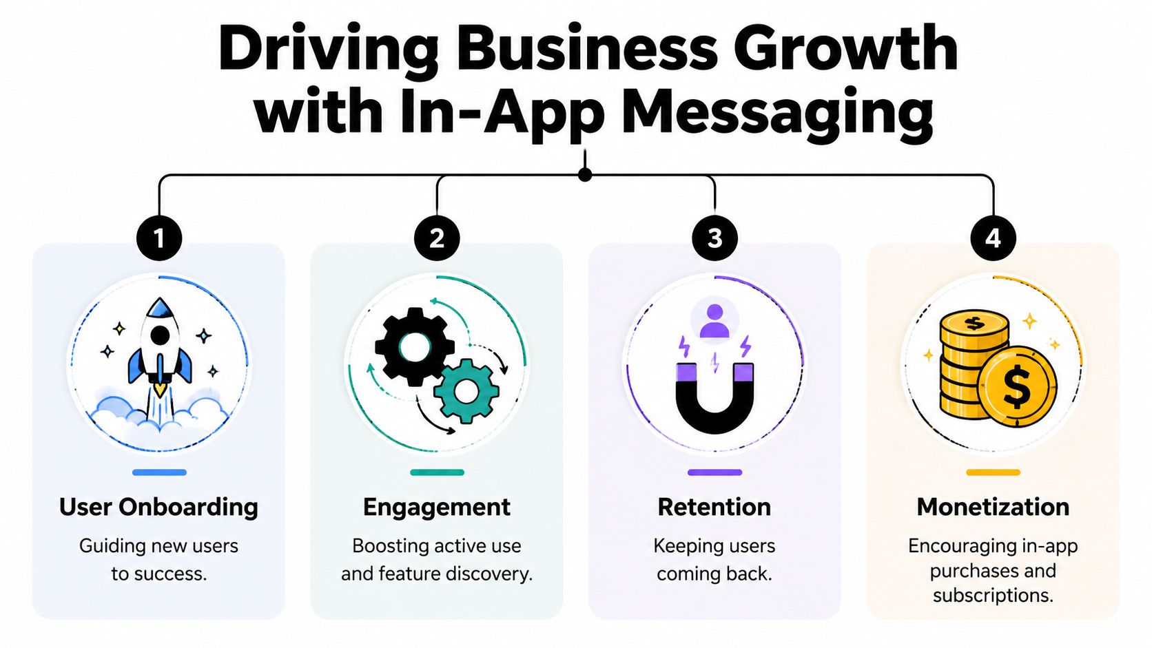
Onboarding and activation
New users don't need a product tour that explains every tab. They need help reaching one useful outcome quickly.
A strong onboarding message is tied to an action already in progress. In a budgeting app, that might be a tooltip that appears after the first account connection and points to recurring expense setup. In a game, it might be a short full-screen scene after the first match that introduces the reward loop and the next objective. In a creator tool, it might be a checklist made available only after the first project is created.
Contextual guidance matters because timing matters. Refiner's summary of Localytics research notes that apps using in-app messaging boost user retention by up to 3x compared to apps that don't use it at all. That aligns with what mobile product teams see in practice: users stay when the app helps them succeed inside the flow, not when it lectures them at launch.
Retention and churn prevention
Retention work usually fails when teams wait too long. If a user is already gone, external channels have to win them back. In app messages work earlier, while the user still has momentum.
Behavior triggers are more effective than calendar logic. Useful examples include:
- Stalled progress: A user starts a setup flow but doesn't finish.
- Repeated friction: A player fails the same level several times and may need a hint or offer.
- Declining depth: A subscriber opens the app but no longer uses high-value features.
- Return session recovery: A lapsed user comes back and sees a personalized “what changed” screen instead of a generic home page.
Retention messages should remove friction or restore relevance. They shouldn't guilt the user into caring again.
Monetization and paywalls
Paywalls are one of the most impactful in-app messaging use cases, but they work best when they're embedded in a broader product journey.
A good monetization prompt appears at a credible value boundary. For example, after a user exports a file, saves above a free limit, gains access to a premium character slot, or tries to access a pro workflow. The message should connect the offer to the action that triggered it. “Upgrade for unlimited exports” is stronger than “Go Premium” because the reason is obvious.
Mobile teams also need to think beyond the first conversion. Post-trial rescue flows, win-back offers, entitlement-aware upsells, and price-test variants all belong in the same operating model.
LiveOps and feature engagement
For game studios and feature-heavy apps, in app messaging is also a control plane for changing behavior between releases.
A Unity or Unreal team might use it to announce a limited-time event, surface a challenge when a player enters the lobby, or highlight a refreshed store bundle after a milestone. A productivity app might use a banner to introduce a newly released AI tool only to users who've already adopted adjacent features.
That's where in app messaging becomes more than communication. It becomes runtime product design.
In-App Messages vs Push Notifications Email and Interstitials
Choosing the channel starts with one question: Are you trying to influence behavior during an active session, or are you trying to create a session? Teams blur that line all the time.
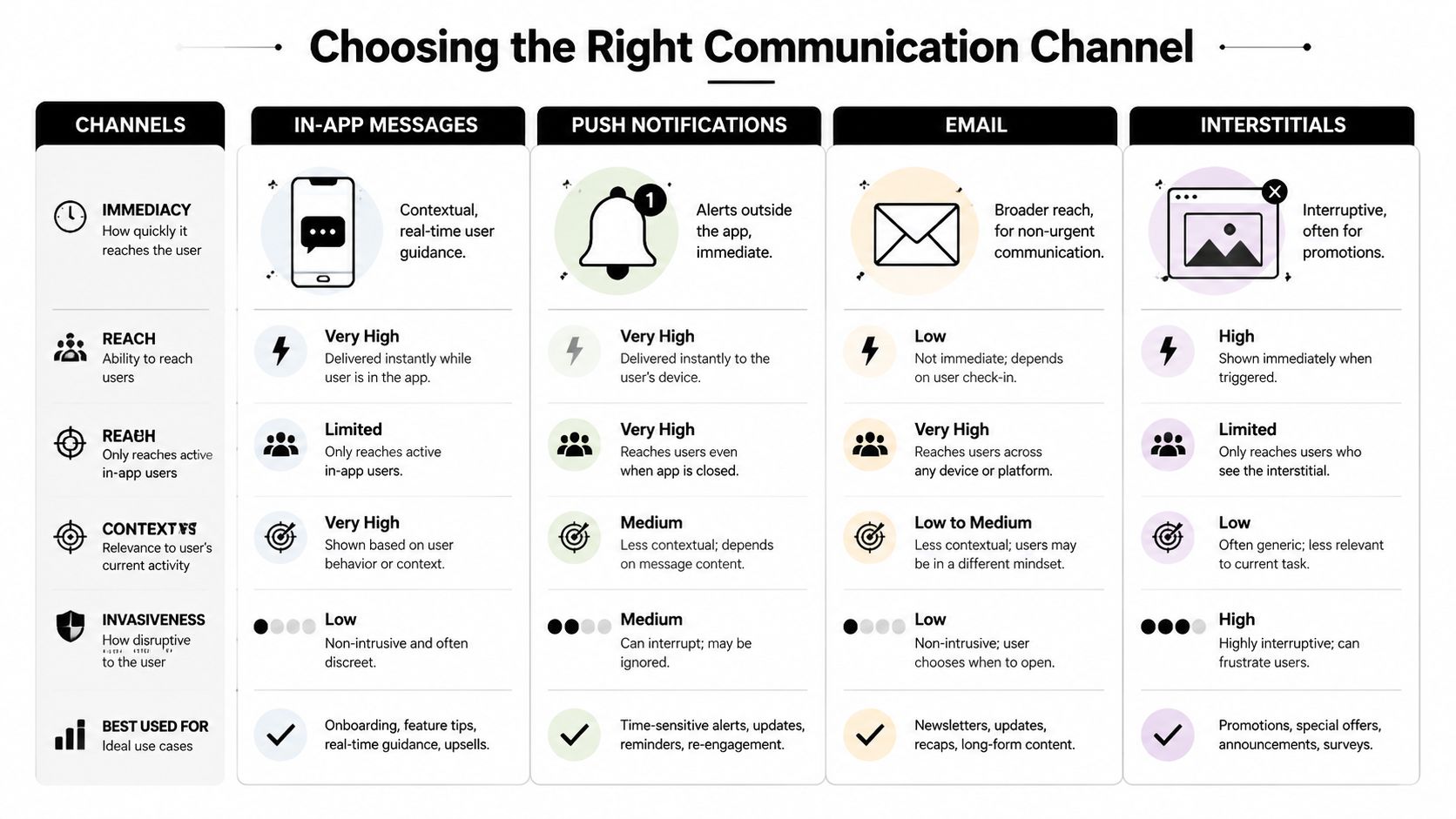
Where each channel fits
| Channel | Best use | Main constraint | Content style |
|---|---|---|---|
| In-app messaging | Guide, educate, convert during active use | Only reaches active users | Rich, contextual, interactive |
| Push notifications | Bring users back to the app | Depends on OS permission and delivery | Short, urgent, external |
| Broader lifecycle communication | Competes in the inbox | Longer-form, asynchronous | |
| Interstitials | Aggressive promotion or ad inventory | Highly interruptive | Full-screen, limited nuance |
The big technical advantage of in app messaging is reach within the active session. Airship's explainer on in-app messaging notes that in-app messages can reach 100% of active audience users, including the approximately 50% who have opted out of or remain invisible to external push notifications.
That doesn't make push obsolete. It makes the relationship clearer. Push is often the doorbell. In app messaging is the conversation after the user opens the door.
Trade-offs teams should actually care about
A lot of comparison guides stay superficial, so it's worth getting concrete.
- Permissions: Push depends on OS-level opt-in. In app doesn't. That changes your reachable audience immediately.
- Context: Email and push usually know less about what the user is doing right now. In app can fire on the exact screen, event, or state change.
- Richness: In app experiences can support longer copy, richer layouts, multiple actions, and embedded surveys. Push needs brevity.
- Intrusiveness: Interstitials are useful when you want to stop the user cold. Most of the time, that's too expensive from a UX standpoint.
- Sequencing: Good systems use these channels together. Bad systems let each tool blast users independently.
A practical orchestration model
Use channels in this order of intent:
- In app first when the user is active and the action can happen immediately.
- Push second if the action matters but the user leaves before seeing the in-app prompt.
- Email later when the message needs detail, recap, or broader lifecycle context.
That sequencing reduces waste. It also prevents a common failure mode where users get a push notification for something they already saw, dismissed, or completed in session.
The best multi-channel strategy isn't the loudest one. It's the one that knows when to stay quiet because the user already acted.
Essential Message Types and UX Patterns
The centered modal is overused because it's easy to ship and impossible to miss. That doesn't mean it's the right pattern.
Full-screen flows for decisive moments
Full-screen experiences work when the user has reached a meaningful boundary. Paywalls are the obvious example, but not the only one. Major onboarding steps, mandatory version-update notices, premium feature gates, and game event reveals can all justify a full-screen treatment.
The key is commitment. A full-screen flow should support one primary job and a clear next action. If you're asking the user to compare plans, confirm a choice, or move through a multi-step setup, this format gives you enough room to do it properly.
Modals, banners, and tooltips for lighter guidance
Smaller patterns belong closer to the workflow.
A modal can handle a short announcement, a new feature prompt, or a one-question survey. A banner works better when the message should stay visible without blocking progress, such as an entitlement issue, a limited-time offer, or a reminder tied to the current screen. Tooltips are strongest when attached to a specific UI element and weakest when they try to teach the entire product.
Here's a simple way to decide:
- Use a tooltip when the user is already looking at the feature.
- Use a banner when the message matters but shouldn't stop the task.
- Use a modal when you need a decision.
- Use full screen when the moment changes the journey.
Interactive patterns that gather data, not just clicks
The most useful in-app messages often ask for input. A quiz can route new users into the right onboarding path. A preference picker can tailor content or notification defaults. A quick survey after a failed purchase can tell you whether the problem was price, trust, or technical friction.
For teams building more complex flows, a visual builder matters because it shortens the iteration cycle between idea and release. A strong example is a dedicated in-app flow builder for mobile apps and games, where product, growth, and engineering can collaborate on screens, triggers, and experiments without turning every copy change into a native release.
One message should carry one cognitive load. If the user has to read, choose, compare, and remember at the same time, the design is doing too much.
Platform detail matters here. iOS and Android users expect native-feeling motion and spacing. React Native and Flutter teams need consistency across platforms without flattening platform-specific behavior. Unity and Unreal teams need overlays that respect framerate, input, and game-state timing. The pattern isn't just visual. It has to fit the runtime.
Implementing a Modern In-App Messaging System
A modern in-app messaging system lives or dies on one decision early in the architecture. Will the app render hardcoded message screens, or will it use a runtime that can fetch, target, and display experiences remotely? Hardcoded screens are fine for a one-off promo. They break down once growth, product, and lifecycle teams need to change timing, eligibility, pricing copy, or layouts without waiting for the next release train.
Build the runtime first
Start with delivery infrastructure, not templates. The core stack usually includes a client SDK, event ingestion, remote config, audience evaluation, a rendering layer, and analytics hooks that write exposure and outcome data back to your warehouse or product analytics tool. If you support iOS and Android plus React Native, Flutter, Unity, or Unreal, this matters even more. Separate implementations turn every experiment into a platform coordination problem.
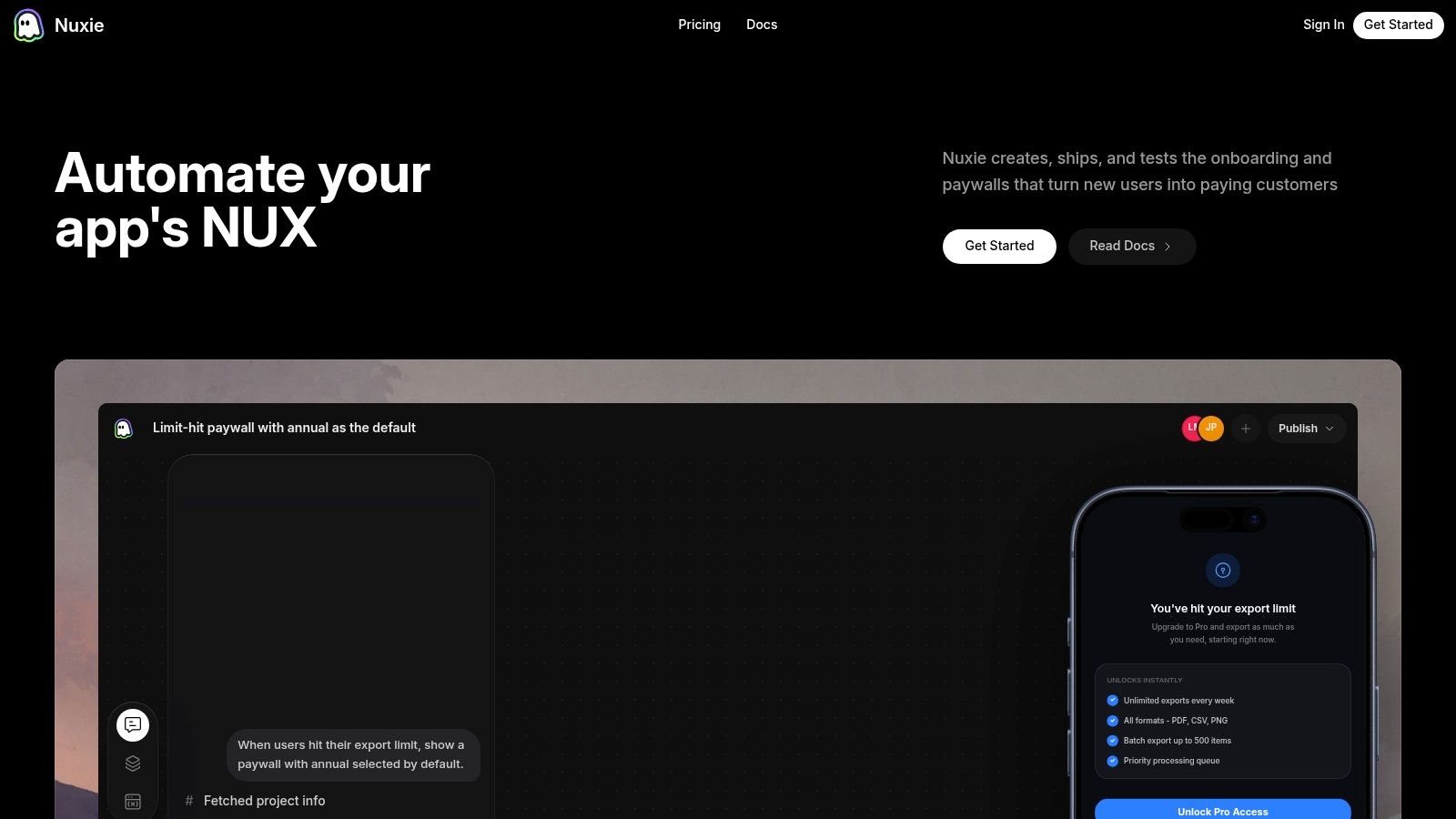
A capable runtime should handle:
- Event-triggered delivery based on user behavior and app context, not just time since install
- Audience targeting using lifecycle stage, feature usage, subscription status, entitlement state, and custom attributes
- Offline-ready delivery so pre-fetched experiences can still render during weak connectivity
- Frequency capping and priority rules so upgrade prompts, onboarding cues, and win-back messages do not compete in the same session
- Remote publishing so product and growth teams can ship changes without rebuilding the app
The business case is straightforward. If billing and entitlement data are available at decision time, the same system can suppress upgrade prompts for active subscribers, show save offers to users with failed renewals, and route churn-risk cohorts into recovery flows before they lapse. That is the difference between a messaging layer that announces things and one that moves revenue and retention.
Personalization depends on data shape
Personalization fails when the data model is thin. Dynamic payloads need more than a first name and a locale. They should support values like trial days remaining, current plan, consumable balance, last purchase outcome, reward streak, cart value, feature adoption milestones, and eligibility flags computed on the server.
That lets teams render messages that match commercial context. “Your annual plan renews in 3 days” is useful. “You still have 120 credits to use before upgrading” is stronger because it ties the prompt to current value and reduces the chance of showing the wrong CTA.
Interactive experiences can also lift engagement compared with static banners, especially when they ask the user to choose, confirm, or continue. The gain comes from lower friction and better timing, not animation for its own sake.
A platform approach helps because trigger logic, presentation, and experiment setup can evolve independently. Product can update copy and layout. Growth can test holdouts and pricing frames. Engineering keeps a stable runtime and schema contract. Teams comparing architectures should look closely at an in-app experience platform for mobile apps and games that combines rendering, targeting, analytics, and experimentation in one layer.
Code-level concerns that matter in production
Many implementations get expensive to maintain.
- Guard against stale triggers: Re-check entitlement and offer eligibility right before render. A paywall shown after a successful purchase creates support tickets and refund risk.
- Debounce noisy events: Scroll, resume, and screen-view events often fire in bursts. Without debounce logic, the same user can qualify for the same campaign multiple times in one session.
- Version your payload schemas: New fields should fail safely on older app versions with explicit defaults, not blank states or broken layouts.
- Track dismissals and downstream outcomes: Log impression, visible, tap, dismiss reason, conversion event, and any later purchase or retention event tied to the campaign ID.
- Respect render timing: Wait until the screen is stable and the input stack is clear. In games and animation-heavy apps, bad timing hurts frame pacing and makes overlays feel broken.
A clean implementation also separates decisioning from rendering. The server or rules engine decides eligibility. The client validates local state, fetches assets, and renders only if the experience is still valid. That extra check prevents outdated prompts after account changes, restores, or receipt refreshes.
Provider choice should be practical. Few teams want to replace analytics, billing, CRM, and messaging systems at the same time. A provider-agnostic setup is easier to adopt because it can read from existing tools, write outcomes back to systems of record, and let you tie message performance to purchases, renewals, and retained subscriber cohorts instead of just taps.
How to Measure Success and Drive Performance
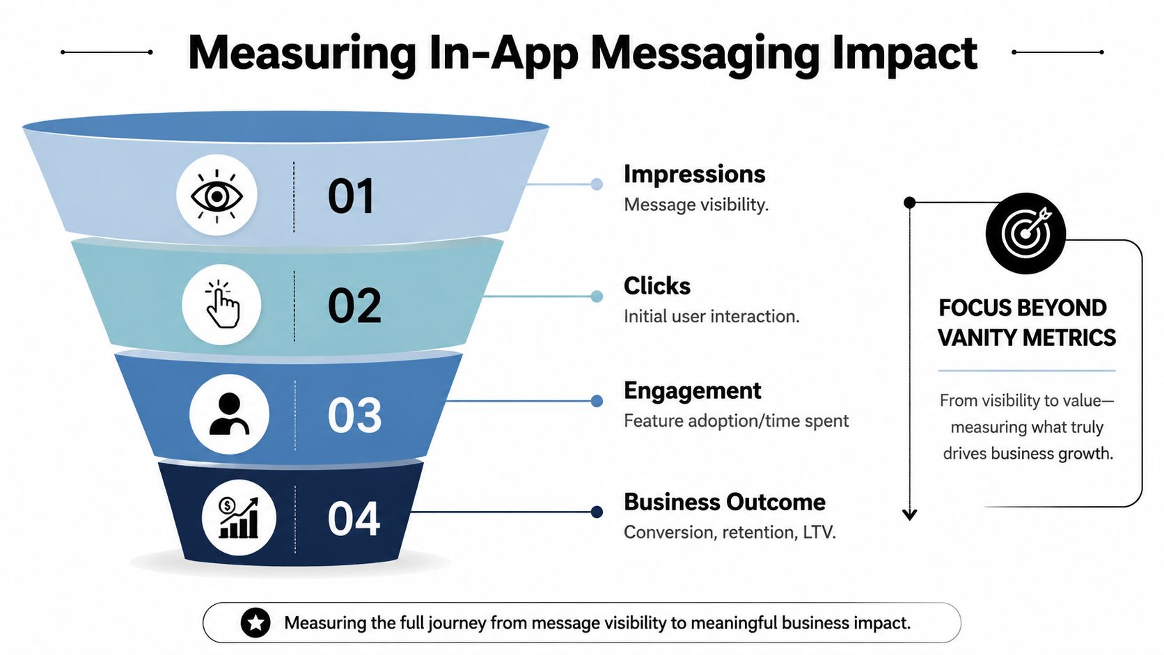
Small changes in message timing or audience can change purchase rate, renewal rate, and week-one retention more than copy tweaks ever will. That is why measurement has to start with business outcomes, not campaign activity.
If the dashboard stops at impressions, clicks, and dismissals, the team still does not know whether the message changed anything that matters. A tapped tooltip can look successful while feature adoption stays flat. A lower-CTR paywall can produce more completed purchases, fewer accidental closes, and better subscriber quality over the next 30 days.
Measure in layers, but report on lift
Good teams still track delivery and interaction. They just do not mistake those metrics for impact.
Use four measurement layers:
- Exposure: eligible, delivered, rendered, visible for a minimum threshold
- Interaction: tap, dismiss, expand, submit, secondary CTA
- Behavior: onboarding completion, feature adoption, return session, content consumption
- Business: trial start, purchase completion, renewal, churn, ARPU, retained subscriber rate
The reporting model should answer one question: what changed for users who saw the message versus a valid control group? Without that comparison, every chart is vulnerable to selection bias. Power users click more. New users churn more. Subscribers behave differently from expired users before any campaign goes live.
Tie attribution to lifecycle and entitlement state
In-app messaging becomes much more valuable when it is joined to billing and entitlement data. That is the difference between measuring “users who tapped upgrade” and measuring “expired annual subscribers who restored access within seven days after seeing a rescue message.”
For subscription apps, map each impression to the user's commercial state at the time of exposure. Trial eligible, active subscriber, grace period, billing retry, canceled but still entitled, expired, lifetime purchaser. Those states matter because the same creative can perform well for one segment and hurt conversion for another. Prompting an active subscriber with an upgrade message is not just wasted inventory. It creates confusion and support load.
For games and hybrid monetization apps, connect the message to store events, ad monetization, and progression. For example, a LiveOps offer may raise IAP revenue but reduce rewarded-ad views from a segment that was previously monetizing well through ads. Net revenue matters more than local conversion.
Build the event model before running campaigns
A lot of measurement problems start in instrumentation, not analysis. The event schema needs enough detail to reconstruct what happened later.
At minimum, log:
campaign_idandvariant_id- trigger event and trigger timestamp
- rendered timestamp and visible timestamp
- placement or screen context
- user lifecycle state
- entitlement state at exposure
- dismiss reason
- downstream conversion event
- revenue event value and currency, if applicable
A clean attribution window also matters. For a tooltip tied to feature adoption, a 24-hour window may be enough. For a subscription rescue flow, seven to 14 days is often more realistic because billing retry, restore behavior, and renewal events take time to settle.
Run experiments that can change the P&L
Creative tests have value, but timing, audience, and offer logic usually create the bigger gains.
Start with experiments like these:
Behavior trigger vs fixed delay
Trigger on a meaningful action, such as hitting a paywall boundary or completing a core task, then compare it with a message shown after a generic session delay.Audience split by commercial state
Test different treatments for active subscribers, trial users, expired subscribers, and never-paid users instead of sending one generic prompt to everyone.Offer logic tied to entitlement data
Compare a win-back message for expired users against a standard upgrade prompt. Measure completed purchases, refund rate, and renewal quality, not just starts.Format intensity
Test whether a banner, card, or full-screen takeover produces better downstream results for the same segment. The stronger interruption is not always the better business choice.
For teams that want a stronger testing discipline, this guide to A/B testing for mobile apps is a useful reference because it treats experimentation as part of product delivery and measurement, not a reporting exercise after launch.
Watch for delayed costs
Some in-app messages look great in the first 24 hours and fail once the full user journey plays out. I have seen upgrade prompts increase trial starts while lowering renewal quality because the message attracted low-intent users. I have also seen aggressive onboarding prompts improve feature discovery while hurting day-two retention because they interrupted the first-time experience too early.
That is why success reviews should include lagging metrics. Renewal, refund rate, support contacts, churn after exposure, and retained revenue by cohort belong in the same readout as clicks and conversions.
The standard is simple. Measure the message by the commercial and retention outcomes it changes, then keep the variants that improve those outcomes after entitlement state, audience mix, and experiment design are controlled for.
Your First In-App Messaging Workflow
Start with one message tied to one business outcome. Don't begin with a full campaign calendar.
A reliable first workflow looks like this:
Pick a moment with clear intent
Choose a feature announcement, upgrade boundary, onboarding step, or return-session recovery point.Define the audience tightly
Use behavior, lifecycle stage, and entitlement state. “All users” is rarely a good starting segment.Choose the lightest UX pattern that can still do the job
If a banner can teach the feature, don't ship a modal. If a full-screen paywall is required, make sure the trigger is earned.Set a control group before launch
You need a baseline to know whether the message changed behavior.Measure one real outcome
Track activation, feature adoption, purchase completion, retention, or entitlement change. Clicks alone won't tell you enough.
The strongest in-app messaging systems don't feel like campaigns pasted onto the product. They feel like the app responding intelligently to what the user is trying to do.
Nuxie brings that operating model into one place. It's an AI-native mobile growth platform for apps and games that combines in-app experiences, experimentation, analytics, billing, subscription sync, and entitlements across iOS, Android, React Native, Flutter, Unity, and Unreal. Teams use it to ship onboarding flows, surveys, feature announcements, LiveOps moments, and paywalls without app releases, while staying provider-agnostic and avoiding a revenue-share fee on billing and entitlement data.