
App Onboarding Screens: Master UX & Boost Retention 2026
Master app onboarding screens. Our 2026 guide covers UX patterns, strategy, and optimization to boost retention & activation for mobile teams.
Most advice about app onboarding screens is still stuck in an older mobile era. It tells teams to open with a neat sequence of benefit slides, add a few illustrations, then hope users remember enough to reach the first useful action.
That pattern underperforms because it treats onboarding like a presentation. Strong onboarding behaves more like a guided product interaction. It gets users to value fast, adapts to context, and keeps improving after launch instead of being frozen into the app binary for months.
Technical teams, growth teams, and game teams all feel the cost when onboarding is wrong. Activation drops, permission prompts miss, paywalls appear too early, and design debt piles up across iOS, Android, React Native, Flutter, Unity, and Unreal. Good app onboarding screens fix those problems by connecting UX choices, instrumentation, remote delivery, and experimentation into one system.
Stop Using Onboarding Carousels
Multi-screen onboarding carousels are still the default in far too many apps. They look harmless. They're easy to mock up, easy to localize, and easy to ship. They're also usually the wrong place to spend effort.
The biggest problem is simple. Users skip them. The long-running carousel pattern persists even though 90% of users skip these screens immediately, which makes carousels obsolete for 90% of cases according to this breakdown of why carousel onboarding fails. If your main onboarding asset gets ignored on first launch, it isn't onboarding. It's decoration.
What success actually looks like
Teams shouldn't judge onboarding by whether the screens look polished. They should judge it by whether a new user reaches a meaningful first action with clarity and momentum.
That usually means one of these outcomes:
- First utility reached fast: The user creates something, sees personalized content, completes setup, or starts a core game loop.
- Intent captured at the right moment: The app learns enough to tailor the next step without forcing a long questionnaire upfront.
- Friction delayed until value is visible: Sign-up, payment, or permissions happen after the user understands why the request matters.
Practical rule: If a screen doesn't help a user reach value or remove immediate confusion, it probably shouldn't be in first-run onboarding.
Why the carousel pattern breaks
Carousel onboarding assumes users need a feature tour before touching the product. In practice, most mobile users already understand the basics of app navigation. What they don't understand is why your app deserves their time.
Static slides fail because they separate explanation from action. They front-load messages, hide the interface, and consume the most valuable attention window before the user has any reason to care. That's especially costly in finance, health, social, and game onboarding, where the first minute should build confidence through doing, not reading.
A better baseline is a short, value-first flow that teaches by interaction. For some teams, that means one welcome screen and immediate entry. For others, it means a short quiz, an empty state with a clear CTA, or a guided first task. The key is that the flow responds to product reality, not design tradition.
Teams that want a stronger framework for that shift should look at modern mobile app onboarding best practices, especially around shortening time-to-value and replacing generic intros with contextual guidance.
What to remove first
If you're auditing existing app onboarding screens, start by cutting:
- Feature lists disguised as onboarding: Users don't need a brochure.
- Illustration-heavy slide decks: Nice art doesn't create activation.
- Mandatory account walls before value: These kill curiosity.
- Permission requests on launch: Ask only when the user understands the benefit.
Users don't keep apps because they read three welcome cards. They keep apps because the product did something useful before attention ran out.
Define Your Onboarding Goals and Metrics
A surprising number of onboarding redesigns start with layout discussions. That's backwards. The first question isn't what your app onboarding screens should look like. It's what user behavior they need to create.
Onboarding is a critical determinant of retention. If users don't perceive clear value in the first week, 90% churn, while personalized first-run experiences boost retention by 35% and interactive tours increase activation by 50% according to compiled onboarding statistics from UserGuiding. That makes goal-setting imperative. If your flow isn't built around a specific first win, you'll optimize cosmetics instead of outcomes.
Pick one primary job
First-run onboarding is often overloaded when it attempts to educate, personalize, capture permissions, collect registration, and sell a subscription all at once. That rarely works.
Choose one primary job first, then support it with secondary goals. A few common patterns:
- Activation-led apps: Get the user to complete setup and perform the core action.
- Content-led apps: Capture enough preference data to improve the first feed or recommendation set.
- Subscription-led apps: Build confidence and relevance before exposing a paywall.
- Game onboarding: Teach the first loop, not the full system.
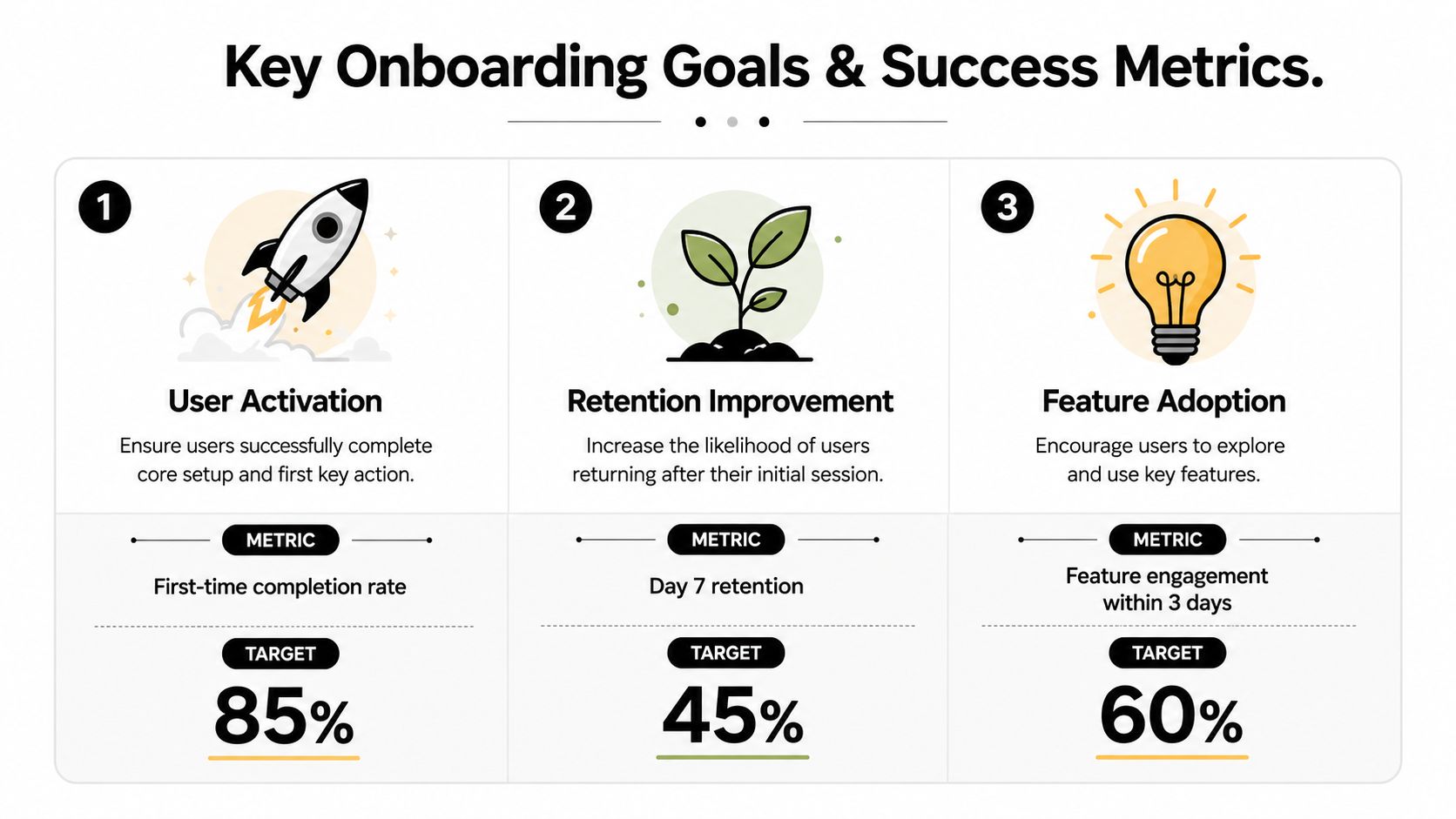
The target values shown in the infographic are useful internal planning examples, but your team should set targets from your own baseline, category, and traffic quality.
Compare the main goal types
Not every app needs the same onboarding architecture. Consequently, teams often waste time by copying consumer app patterns into products with very different user intent.
| Goal type | Best onboarding shape | Good fit | Common failure |
|---|---|---|---|
| Activation | Guided first task | Utility apps, creator tools, fintech setup | Too much explanation before action |
| Personalization | Short preference capture | News, media, wellness, commerce | Asking hard questions too early |
| Monetization | Value proof before offer | Subscriptions, premium utilities, games | Paywall shown before trust |
| Feature discovery | Contextual nudges after entry | Complex apps with multiple surfaces | Feature dump on first launch |
Metrics that matter in kickoff
A practical onboarding kickoff should end with a short metrics sheet that product, engineering, design, and growth all agree on.
Use a checklist like this:
- Primary activation event: What exact event means the user got the first win?
- Onboarding completion definition: What sequence counts as completion?
- Drop-off checkpoints: Where are users most likely to leave?
- Permission timing metric: Which request matters, and when should it appear?
- Monetization trigger: If there's a paywall, what proof of value should precede it?
If a team can't name the first win in one sentence, the onboarding flow will drift.
The biggest mistake isn't choosing the wrong metric. It's choosing too many. One clear primary goal keeps copy tighter, screens shorter, analytics cleaner, and experiments more interpretable.
Select the Right UX Onboarding Patterns
Once the goal is clear, pattern choice gets easier. Strong app onboarding screens aren't built from trends. They're assembled from a small set of UX patterns, each suited to a specific job.
The right question isn't "What do top apps use?" It's "What interaction gets this user to the first win with the least friction?"
Modern App Onboarding Pattern Comparison
| Pattern | Best For | Pros | Cons |
|---|---|---|---|
| Benefit-led welcome screen | Simple utility apps, content apps | Fast to understand, easy to localize, low build effort | Weak if it replaces real interaction |
| Interactive tutorial | Tools, creation apps, many games | Teaches by doing, stronger comprehension, clearer activation path | Needs tighter implementation and event tracking |
| Progressive disclosure | Complex products, finance, pro workflows | Prevents overload, reveals detail when needed | Requires disciplined trigger logic |
| Contextual tooltips and hotspots | Multi-feature products after entry | Helps discovery without blocking flow | Easy to overuse and annoy users |
| Preference quiz | Media, wellness, personalization-heavy apps | Improves relevance early, supports segmentation | Bad if questions feel intrusive or long |
| Deferred account creation | Apps with immediate value before login | Reduces friction, increases trust | Needs careful sync and save-state handling |
| Permission priming screen | Camera, notifications, location, health access | Increases clarity and intent before system prompt | Adds clutter if shown too early |
| Paywall after first value | Subscription apps, premium games | Better context for pricing, stronger conversion intent | Poor timing can still break momentum |
Use fewer patterns, better
Many teams combine too many patterns in one first-run sequence. The result is clutter. A better flow usually has one primary pattern and one support pattern.
A finance app might use a short trust-setting welcome, then progressive disclosure for sensitive setup. A game might use an interactive tutorial first, then contextual prompts after the first level. A news app might open with a preference quiz, then defer account creation until the user sees a tuned feed.
Copy and visual rules that hold up
Good onboarding copy is operational. It tells the user what happens next and why it matters. Bad copy reads like marketing.
Do this:
- Name the next action clearly: "Choose your interests" beats "Let's personalize your journey."
- Tie requests to benefit: "Enable notifications for breaking match updates" is stronger than "Stay in the loop."
- Keep each screen to one job: Don't mix setup, education, and persuasion in one panel.
- Use visuals as support, not content: Screenshots, motion cues, or live UI fragments work better than decorative illustrations.
Avoid this:
- Abstract value props: Users don't act on vague promises.
- Long text blocks: Reading load slows action.
- Identical screen structures: Repetition makes swiping automatic.
- Hard questions upfront: Sensitive or effortful inputs belong later, after commitment starts building.
Good onboarding copy answers two questions fast. What do I do now, and why should I care?
Match pattern to product type
A few practical mappings help:
- Health and wellness apps: Use short preference capture and gentle sequencing. Explain why personal inputs matter.
- Social and content apps: Prioritize feed relevance quickly. Don't trap users in pre-entry forms.
- Games built in Unity or Unreal: Teach one core loop with interaction, then release the player into play.
- Flutter and React Native apps: Favor patterns that can be reused across platforms without diverging UX logic.
- Developer or productivity tools: Start with an empty state plus one guided action instead of a tour.
If a pattern doesn't shorten confusion or accelerate the first win, cut it.
Implement Onboarding Flows Without App Releases
Hardcoded onboarding is one of the most expensive habits in mobile product work. It slows iteration, forces design compromises, and turns simple copy or sequencing changes into release-management work.
That doesn't mean every onboarding component should live outside the app. It means the growth-critical layer should be decoupled from the binary wherever possible.
The architecture trade-off
Native development still matters when the experience depends on superior performance and deep device integration. Cross-platform frameworks such as React Native and Flutter trade some native feel for efficiency. A server-driven UI approach can bridge that gap by delivering native-quality experiences across both, as explained in this analysis of native vs cross-platform development.
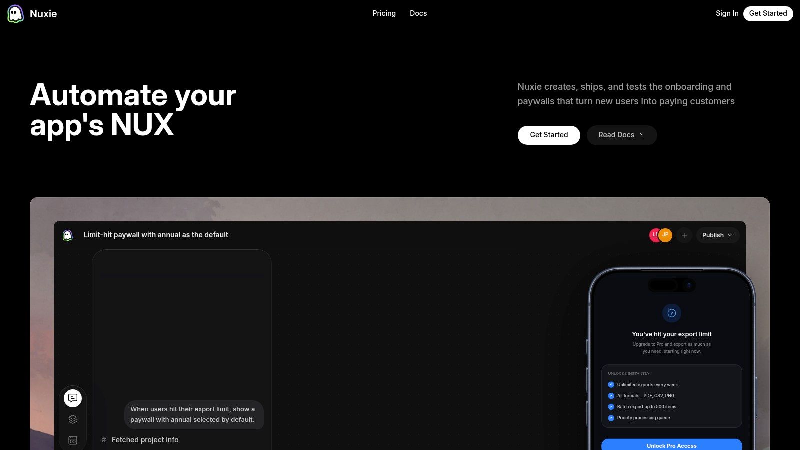
That trade-off shows up immediately in onboarding. If your first-run flow is fully embedded in Swift, Kotlin, or game client logic, every experiment competes with release bandwidth. If the flow is remotely configurable, teams can adjust sequence, copy, branching, targeting, and monetization timing without waiting for store approval.
What should be remote and what should stay local
Technical teams need discipline. Not everything belongs in a remote flow system.
Keep these local in the app:
- Core product logic: Authentication, state management, entitlement checks, and business rules.
- Performance-sensitive interactions: Heavy gameplay, camera pipelines, or advanced rendering.
- OS-specific APIs: Deep device features, platform purchase handling, and system callbacks.
Move these into a remotely managed onboarding layer:
- Screen order and branching
- Copy, media, and CTA variants
- Eligibility logic for segments
- Feature announcements and contextual education
- Paywalls, upsells, retention offers, and post-install journeys
For teams working across iOS, Android, React Native, Flutter, Unity, and Unreal, that split matters even more. It keeps the product stable while letting growth operators and product managers ship onboarding updates without asking client engineers for every change.
Implementation checklist for mobile and game teams
A practical implementation usually looks like this:
Instrument events first
Define entry, step view, CTA tap, skip, completion, permission prompt, paywall exposure, purchase, and dropout events before redesigning UI.Map the state model
Decide what determines which onboarding flow a user sees. New install, returning user, subscriber, payer, trial user, and anonymous visitor often need different paths.Design for fallback
Remote flows should fail gracefully. If a config doesn't load, the app still needs a sane local default.Separate content from release logic
Treat screen payloads, targeting, and experiment assignments as data. Keep only the rendering runtime in the app.Review analytics ownership
Product, growth, and engineering should agree on the canonical event names and destination tools.
The fastest way to make onboarding obsolete is to ship it as a one-off feature instead of a configurable system.
Teams exploring this model should study how a mobile in-app flow builder works in practice, especially if they want one runtime across native, cross-platform, and game engines.
Why this matters beyond onboarding
Once the runtime exists, onboarding stops being an isolated project. The same delivery model can run surveys, feature education, win-back offers, paywalls, liveops surfaces, and entitlement-aware experiences without duplicating UI work across platforms.
That's why modern teams don't separate onboarding architecture from growth architecture. They're the same problem.
Optimize Onboarding with Experiments and Analytics
A launch-ready onboarding flow isn't finished. It's only instrumented enough to start learning.
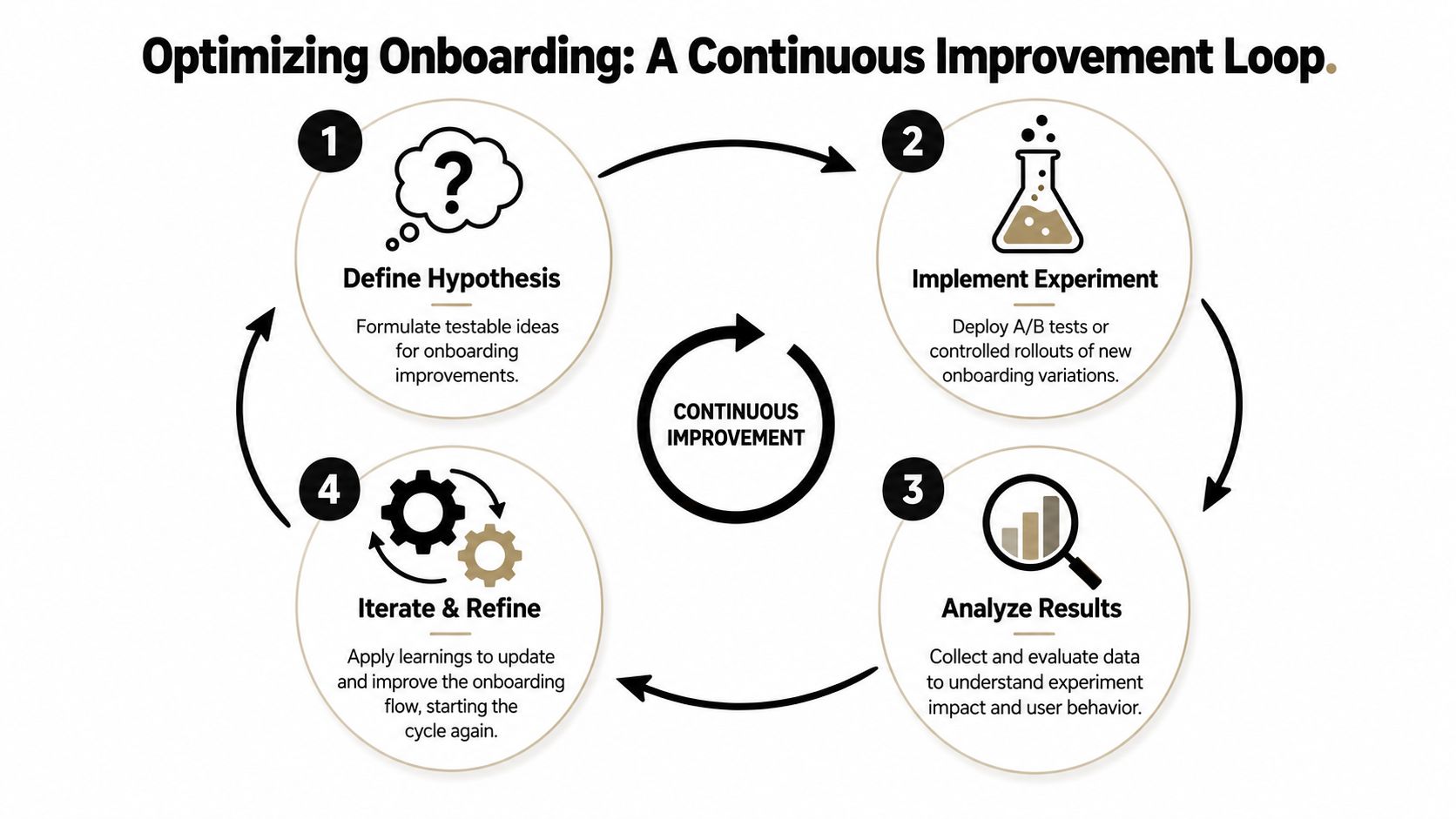
The global onboarding completion rate for mobile apps is only about 8 to 9%, and most apps lose over 90% of users before completing onboarding, according to Digia's roundup of onboarding rates and implementation guidance. Teams that treat first-run UX as fixed creative miss the actual work, which is identifying where users stall, forming a clear hypothesis, and changing one thing at a time.
Use a narrow experiment model
The most reliable onboarding optimization process is simple. Define success metrics, identify the minimum steps to a user's first win, then test one variable at a time. That methodology has produced a 49% increase in Day 30 activation rates and a 40% increase in opt-in rates over category averages for some apps according to Sendbird's onboarding guidance.
Don't redesign the whole flow because completion is weak. Isolate one variable:
- Step order
- CTA copy
- Whether sign-up is deferred
- Whether a permission explanation appears before the OS prompt
- Whether a paywall comes before or after the first useful action
- Whether a quiz asks difficult questions earlier or later
Instrument the funnel like a product feature
Product teams often track install, signup, and purchase, then leave the rest of onboarding opaque. That's not enough.
Track the flow as a sequence of state transitions, not just page views. You need to know:
| Funnel layer | What to capture | Why it matters |
|---|---|---|
| Entry | install source, app version, platform, user type | separates acquisition issues from UX issues |
| Step engagement | views, taps, skips, dwell signals | shows where attention drops |
| Decision moments | sign-up accept or dismiss, permission allow or deny, paywall continue or exit | reveals timing problems |
| Outcome | activation event, retention cohort entry, purchase or entitlement state | ties onboarding changes to business impact |
A provider-agnostic setup is useful here. Teams often already use tools like Mixpanel, warehouse pipelines, store billing systems, or entitlement services. The best onboarding stack doesn't force a rip-and-replace. It should work with existing analytics, billing, and subscription data, especially when paywalls are part of the journey.
This is also where no-revenue-share infrastructure matters for billing and entitlement data. If onboarding, offers, and monetization events are connected, teams need clean access to the underlying signals without handing over a slice of app revenue for visibility.
Before changing anything, watch a recent walkthrough on testing and iteration:
What teams should test first
Start with the step that has the highest drop-off and the shortest path to implementation. That's where learning compounds fastest.
A practical first testing queue:
- Remove one field or one screen: See if completion rises without hurting downstream quality.
- Delay account creation: Let users touch value first.
- Rewrite one confusing CTA: Better language often beats a visual redesign.
- Move hard questions later: Users answer more once they've already invested effort.
- Segment by intent: Paid traffic, organic traffic, and referred users often need different first-run flows.
If your stack supports remote variants and event-level analysis, use that to create a continuous loop rather than quarterly redesigns. A solid primer on that operating model is A/B testing for mobile apps.
Onboarding Is a Product Not a Project
App onboarding screens shouldn't be treated like launch assets that get approved once and then ignored. They sit at the intersection of product clarity, growth, monetization, and retention. That makes them a living product surface.
The teams that get this right don't ask whether onboarding is "done." They ask whether the current flow still matches user intent, acquisition mix, platform behavior, and monetization timing. That's a different operating model. It pushes onboarding out of the design handoff and into ongoing product ownership.
The modern standard
A strong onboarding system has four qualities:
- It is value-first: users reach utility before they face friction.
- It is context-aware: the flow changes based on platform, segment, and prior behavior.
- It is remotely configurable: teams don't wait on full releases for every improvement.
- It is measurable: every meaningful step ties back to activation, retention, or revenue outcomes.
That standard applies whether you're shipping a consumer app on iOS and Android, a cross-platform product in React Native or Flutter, or a game built in Unity or Unreal. The delivery details differ. The operating principle doesn't.
AI changes the next step
The next shift isn't more onboarding screens. It's better decisioning. AI-native systems can help teams generate variants, detect weak points in the funnel, adapt screen sequences by audience, and connect onboarding behavior to entitlement, subscription, and lifecycle messaging.
That doesn't remove the need for strategy. It increases the value of clear product thinking. Teams still need to define the first win, identify where friction is useful versus harmful, and decide which moments deserve personalization. AI makes iteration faster. It doesn't replace judgment.
Treat onboarding like a shipped product surface with owners, analytics, and a roadmap, and it starts producing compounding gains.
The best first-run experiences in 2026 won't look like polished slide decks. They'll look like responsive systems that help each user move forward with less friction and more relevance.
Nuxie is built for teams that want that operating model without stitching together separate tools for in-app flows, analytics, experiments, paywalls, billing, subscription sync, and entitlements. It supports iOS, Android, React Native, Flutter, Unity, and Unreal, works alongside existing providers when needed, and gives product, growth, and engineering teams one AI-native platform to design, test, ship, and optimize onboarding and other in-app journeys without revenue-share fees on billing and entitlement data. Explore Nuxie if you want onboarding to run like a growth system instead of a static release artifact.