Android Icon Sizes Guide: Master 2026 App Standards
Master Android icon sizes with 2026 specs for launchers, adaptive icons, notifications & Play Store. Includes essential export tips.
You've probably had this happen already. The icon looks sharp in Figma, the export looks fine in a browser preview, then the final build lands on a Samsung device and the mark feels cramped, soft, or oddly cropped. On a budget phone, it gets worse. The shape that felt balanced on your laptop turns into a vague blob in a dense home screen grid.
Android icon work breaks down when teams treat it like a single asset problem. It isn't. Launcher icons, adaptive layers, notification glyphs, action bar icons, and the Play Store listing each have different jobs, different constraints, and different failure modes. If product, design, engineering, and growth aren't aligned on that, handoff gets messy fast.
That matters most when launch pressure is already high. If you're finalizing screenshots, tuning onboarding, wiring paywalls, or getting the release checklist ready, icon issues can feel minor right up until they block submission or make the app look cheap on-device. That's also why launch planning needs to connect brand, store presence, and in-app experience, not live in separate tracks. The teams that handle that well usually ship cleaner. Nuxie's guide on how to launch an app is a useful companion if you're lining up the broader release motion alongside visual polish.
Introduction to Android Icon Sizing Challenges
Android icon sizing gets tricky because the system is flexible in ways iOS isn't. Different densities, different launchers, and different mask shapes mean one “good” export can still fail in real usage. A polished icon has to survive all of that.
Most design files also lie a little. A large artboard makes fine strokes feel acceptable. Centering looks exact until the icon is shrunk. Text, secondary symbols, and decorative shadows often seem harmless until the launcher clips them or the status bar reduces them to noise.
Three problems show up again and again:
- Blurry exports: Teams ship one raster source and trust scaling too much.
- Mask collisions: Critical details sit too close to the edge and disappear under OEM icon shapes.
- Wrong asset for the job: A full-color launcher icon gets reused for notifications or store listing art without adjusting for context.
Practical rule: If the icon only looks good at design-file size, it isn't ready.
The good news is that Android's constraints are clear once you separate the asset types and build a repeatable export workflow. The reliable path is simple in principle. Design the core mark for recognition first, export for the correct density buckets, keep adaptive artwork inside the safe area, create a separate monochrome system icon set, and validate on actual launchers instead of trusting a desktop preview.
That's the difference between “technically compliant” and “looks native everywhere.” The first gets a build out the door. The second makes the app feel finished.
Understanding Android Icon Categories
Android doesn't use one icon standard. It uses several, each tied to a different surface in the OS and a different user expectation. Teams usually run into trouble when they blend those categories together.
Launcher, adaptive, system, and store assets
The launcher icon is the app's identity on the home screen and in the app drawer. This is the one users scan for repeatedly. It has to be recognizable at a glance, not just attractive in a large mockup.
The adaptive icon is how modern Android launchers render that identity. Instead of a single flat image, Android uses separate foreground and background layers and then applies the device's own mask shape. That's why the same app can look slightly different on a Pixel, Samsung, Xiaomi, or OnePlus device.
The notification icon does a completely different job. It's not branding in the usual sense. It's a small system glyph that needs to remain legible against varied UI chrome.
The action bar icon is also a utility element, not a miniature version of your marketing art. If you treat it like a logo placement, it usually becomes muddy.
Then there's the Play Store listing icon. That one supports discovery and first impression inside Google Play. It's related to launcher design, but it isn't interchangeable with launcher files.
The terms that matter in practice
A few Android terms are worth keeping straight:
- Dp: Density-independent pixels. Android uses this to keep UI sizing consistent across screens.
- Px: Actual rendered pixels in the exported file.
- Safe zone: The center area where key artwork should stay so masking doesn't cut it off.
- OEM masking: Manufacturer-specific icon shapes applied by launchers.
Here's the practical split commonly adopted:
| Icon category | Primary job | Common failure |
|---|---|---|
| Launcher | Home screen recognition | Over-detail, weak silhouette |
| Adaptive | Survive mask shapes | Cropped edges, awkward padding |
| Notification | Status and alerts | Full-color blob, low contrast |
| Action bar | Utility navigation | Branding pushed too far |
| Play Store | Listing presentation | Wrong format or baked styling |
A strong workflow starts by naming the asset correctly before anyone exports anything. Once the team says “this is launcher” or “this is notification,” the design decisions get much easier.
Launcher Icon Sizes Deep Dive
Launcher icons still anchor the whole Android icon system. Even if you're using adaptive icons, the launcher mark is the visual core users memorize. If that mark isn't strong at small sizes, no export workflow will save it.
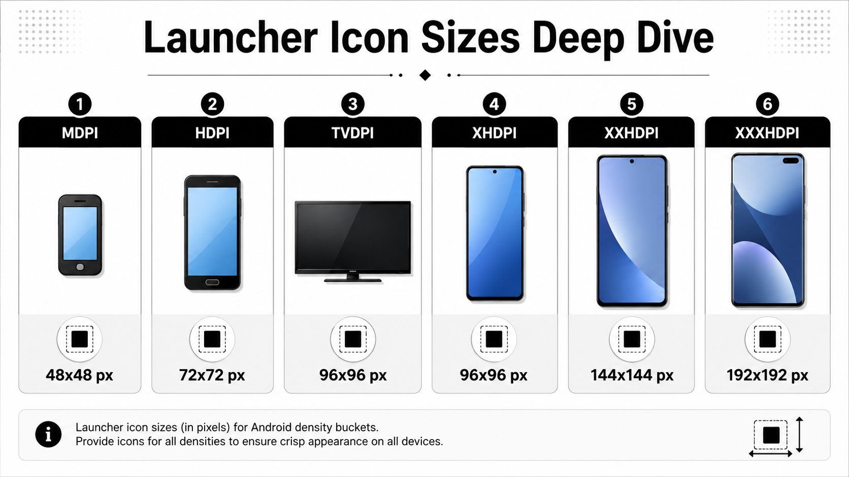
Android launcher exports follow a fixed density system. Android launcher icons must be exported in six specific pixel densities to support the full range of screen types: 48×48 px (MDPI), 72×72 px (HDPI), 96×96 px (XHDPI), 144×144 px (XXHDPI), 192×192 px (XXXHDPI), and the foundational 512×512 px for the Play Store, reflecting Android's density-independent pixel system where 1 dp equals 1 pixel at 160 dpi (MDPI) and scales proportionally, as outlined in this Android launcher size reference PDF.
The density math you actually need
You don't need a long theory lesson to ship this correctly. You need one baseline and a consistent scaling rule.
Start from 48 dp as the launcher standard. From there, Android scales into the density buckets:
- MDPI: 48×48 px
- HDPI: 72×72 px
- XHDPI: 96×96 px
- XXHDPI: 144×144 px
- XXXHDPI: 192×192 px
That ratio matters because icons that are manually resized without respecting density often look optically inconsistent. The curves get too tight, line weight shifts, and empty space feels different across outputs.
Another detail teams miss is padding. Material guidance uses 1 px padding for standard densities and 4 px padding for XXXHDPI in the cited reference above. That sounds minor, but it changes the feel of the icon at the top end. If you export everything with identical edge treatment, the XXXHDPI version can look cramped.
Why the 24 dp visibility test matters
A lot of Android icon guides stop at the 48 px baseline. That's not enough in practice. On crowded home screens and lower-end devices, users often perceive the icon closer to a ~24 dp functional size rather than the idealized design canvas, which is why the Asolytics analysis on Android app icon guidelines is useful as a design warning.
That changes the design brief in a concrete way:
- Simplify the silhouette: If the icon depends on interior detail, it won't survive.
- Thicken important strokes: Hairlines disappear first.
- Separate figure from background: Low-contrast center motifs collapse quickly.
- Remove small text: It becomes texture, not communication.
If the app icon only reads because of a wordmark, it's probably not ready for Android home screens.
This is especially relevant for games, utility apps, and indie products competing in dense grids where nearby icons are also bright, high-contrast, and visually noisy.
A practical export approach
A workflow that holds up under pressure looks like this:
- Build one master vector or high-resolution source with the core mark centered and simplified.
- Check it at tiny preview sizes before exporting full sets.
- Export each launcher density deliberately, not as a casual batch from a generic design tool preset.
- Compare outputs side by side on light and dark wallpapers.
- Validate on at least one low-end or older Android device before signoff.
The best launcher icons usually feel slightly simpler than the team first wants. That restraint is what makes them recognizable.
Adaptive Icon Layer Requirements
Adaptive icons changed Android icon design from a single flat asset into a layered system. That shift is good for platform flexibility, but it punishes loose composition. If your foreground relies on edge detail or decorative framing, adaptive masks will expose the weakness immediately.
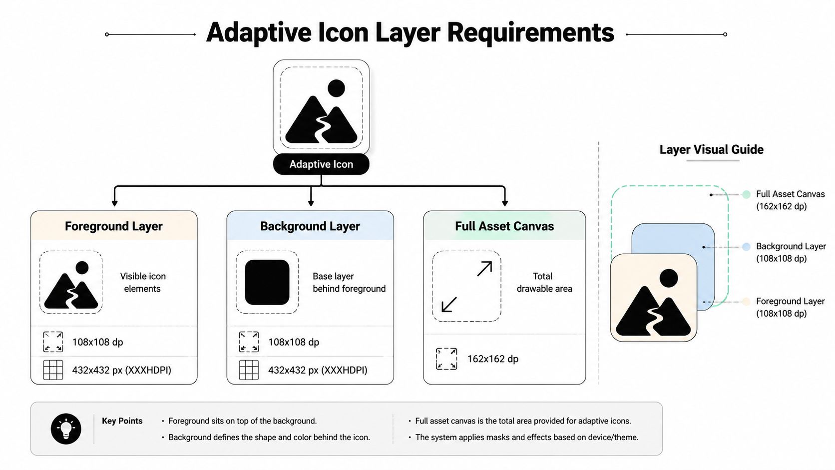
Android adaptive icons, introduced in Android 8.0 (API 26), require exactly two layers, foreground and background, each sized at 108×108 dp, with the full asset size extending to 162×162 dp to accommodate background scaling; the visible safe zone for key artwork is restricted to a 66×66 dp center area to prevent clipping across diverse launcher mask shapes, as documented in this adaptive icon size guide.
What the layers are actually for
The foreground layer contains the essential brand shape or symbol. This is the part users should recognize even if the mask becomes circular, squircle, or rounded square.
The background layer exists to support that foreground, not compete with it. Solid fills and restrained patterns usually work better than complex imagery. Busy backgrounds make the icon feel smaller because they steal contrast from the subject.
The full asset extending to 162×162 dp matters because the launcher can animate and scale the composition. The center-safe design discipline matters because only a limited area remains dependable across mask shapes.
Safe zone discipline
There's a practical difference between “fits the canvas” and “survives the launcher.” Teams often place a badge, corner cut, sword tip, antenna, or secondary shape near the outer boundary because it looks balanced in the design file. Then a device-specific mask trims it.
Use this rule when reviewing adaptive art:
- Keep the main subject centered
- Treat outer space as sacrificial
- Avoid edge-dependent storytelling
- Don't hide meaning in tiny secondary forms
Review cue: If removing the outer ring of detail breaks the icon, the concept is too fragile for adaptive masks.
Some references describe broader visible-area behavior and a larger internal region, but for production work the safest habit is still to preserve the core mark in the center and assume launcher variance will be harsher than the mockup suggests.
Vector XML or PNG
Android supports vector-based adaptive workflows, and that's often the cleaner option for simple geometric icons. Vectors are easier to maintain when color or shape changes late in the cycle.
PNG still has a place. It's usually the practical fallback when the icon includes texture, painterly rendering, or complex gradients that don't translate cleanly into Android drawable XML.
A simple decision rule works well:
| Asset style | Better fit |
|---|---|
| Flat geometric mark | Vector XML |
| Heavy texture or detailed illustration | PNG |
| Frequent late-stage color changes | Vector XML |
| Brand art with complex rendering | PNG |
The most common adaptive mistakes are avoidable: baked-in shadows, rounded corners, text outside the safe zone, and foreground elements that are too large. Android wants layered artwork, not a pre-rendered icon pretending to be adaptive.
Notification and Action Bar Icon Standards
System icons on Android need a different mindset from launcher art. They aren't tiny posters for your brand. They're functional UI signals, and they fail when teams try to squeeze too much personality into them.
The baseline is strict. Notification and status bar icons follow a different standard: at API Level 11+, the required size is 24×24 px (MDPI baseline) with an optical square of 22×22 px, rendered as a single-color white (#FFFFFF) icon on a transparent background, while Action Bar Icons use 24×24 px (MDPI) with a 22×22 px image limit and single-color design (#666666 for small/contextual), according to this Android 4.1 icon size guide.
What works at system size
At this size, clarity comes from silhouette first. Interior detail barely helps. A filled shape with a clean contour usually beats an outlined symbol with clever internal geometry.
That's where the earlier ~24 dp visibility point becomes useful again as a design habit, even though the exact launcher sizing context is different. If a shape can't hold up at tiny perceived size, it won't work in notifications either.
Use these filters before approving a notification icon:
- Can someone identify the symbol instantly without color?
- Does it still read on a transparent background?
- Are the negative spaces large enough to survive scaling?
- Would the icon still work if slightly dimmed by system UI?
Mistakes teams keep shipping
A lot of notification icon problems come from repurposing the launcher asset. That almost never works. Full-color logos flatten into an unhelpful shape when the system enforces monochrome treatment.
Other common misses:
- Thin outlines: They fade or fragment.
- Small counters and badges: They disappear.
- Low internal contrast: It turns into visual mush.
- Brand letters: Usually unreadable at this scale.
Don't design notification icons like logos. Design them like road signs.
Action bar icons need the same discipline. Their role is navigational and contextual. A restrained single-color symbol usually feels more native than a branded miniature.
Legacy edge cases
If you support older Android behavior, there are earlier optical constraints in play. Some references note an older 16×16 px optical square for API Level 9 and earlier. The broader lesson is simple. Older contexts are less forgiving, so simplification matters even more.
A safe internal review process is to check system icons in three ways:
- At actual size on-device
- Against both light and dark surfaces
- Inside a noisy notification stack
If the icon only works in a magnified artboard view, it isn't production-ready.
Play Store Asset Requirements
The Play Store icon is its own deliverable. Teams often assume the launcher export can be uploaded as-is, but store presentation has separate validation rules and a separate review path inside Google Play.
The hard requirement is straightforward. Google Play Store mandates a single high-resolution app icon of exactly 512×512 pixels in 32-bit PNG format with a maximum file size of 1,024KB, a standard established to ensure consistent visual quality across all Android device densities without requiring developers to upload multiple resolutions. Icons failing this dimension, format, or transparency rule are rejected automatically, as stated in this Google Play icon requirement reference.
What to avoid before upload
The most common submission errors are styling decisions baked into the file that Google Play expects to handle itself. If you round the corners, add pre-rendered shadows, or over-style the edge treatment, the final result can look wrong after Play applies its own presentation layer.
A reliable preflight checklist looks like this:
- Keep the source square: Don't pre-mask it.
- Use the required PNG format: Don't swap in JPG or an export with the wrong bit depth.
- Check file weight before handoff: Oversized exports happen more often than teams expect.
- Strip decorative overlays: Especially text and edge effects that only worked in mockups.
Some mobile teams also pair this review with billing and release checks because the Play Console workflow usually happens alongside store metadata, products, and entitlement validation. If that's your setup, Nuxie's documentation for Google Play integrations is a practical reference for the broader release stack around Play, subscriptions, and entitlement data.
Store icon versus launcher icon
The store icon should feel consistent with the launcher icon, but not every design decision carries over cleanly. The store surface gives users more space to perceive polish, while the home screen demands immediate recognition at a much smaller apparent size.
That leads to a useful trade-off:
| Surface | Optimize for |
|---|---|
| Play Store listing | Brand clarity and polished presentation |
| Home screen launcher | Instant recognition and silhouette strength |
If you use a textured game icon, a subtle gradient, or richer lighting, the Play Store file can often support that better than the home screen icon. The mistake is letting them drift so far apart that users don't connect the listing with the installed app.
A final file check takes less than a minute and prevents embarrassing rework. Open the PNG, inspect the dimensions, confirm transparency behavior, and view it on a neutral background. Submission problems here are usually procedural, not creative.
Exporting Icons with Android Studio Asset Studio
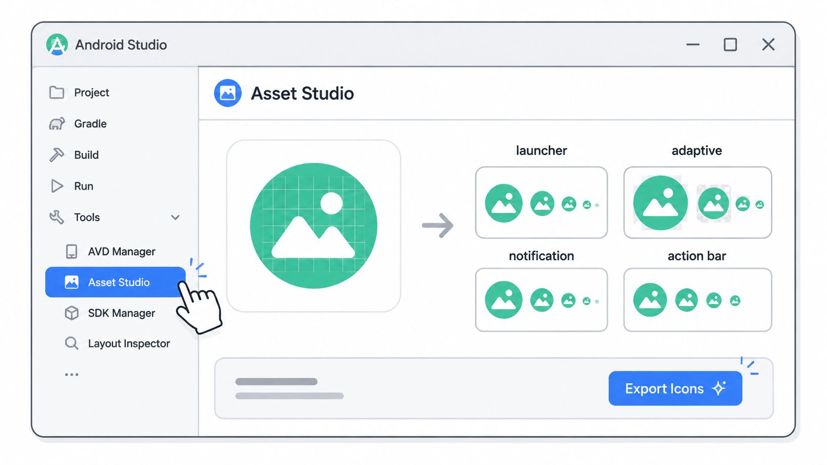
Android Studio Asset Studio is still the fastest way to turn approved artwork into a usable Android icon set without hand-managing every output. It doesn't replace design judgment, but it does remove a lot of mechanical error from the process.
The shortest reliable workflow
In Android Studio, open the project and go to the app module's resource area. Then use the launcher icon generation flow to create or replace the icon assets.
A clean working sequence usually looks like this:
Choose the icon type first
Pick launcher or notification based on the actual asset purpose. Don't start with the artwork.Import the foreground art
For adaptive icons, bring in the main symbol as the foreground and keep the composition conservative.Set the background layer
Use a color or a restrained image treatment. If the foreground is already visually dense, keep the background simple.Adjust scaling and padding in preview
At this stage, many teams rescue a design. If the mark feels too big in one mask preview, it's probably too big overall.Generate and inspect the outputs
Asset Studio writes the files into the expected resource structure, which is much safer than ad hoc export folders on someone's desktop.
What to watch in the preview panel
The preview is valuable because it reveals mask problems quickly. If the icon feels balanced only in one shape, expect trouble on OEM launchers.
Pay attention to:
- Circle previews: These expose edge-dependent compositions fast.
- Foreground scale: If you're tempted to push it larger, stop and test recognition first.
- Background dominance: A loud background can make the icon harder to scan.
- Notification simplification: If you need to squint in preview, the icon is too detailed.
Asset Studio is best used as a validation tool, not just an export button.
Where teams fold this into delivery
Designers usually prepare the source asset in Figma, Illustrator, or Sketch. Android engineers then use Asset Studio to generate the Android-specific outputs and commit them with the build. On tighter teams, this is part of release hygiene, just like checking screenshots, purchase flows, and final strings.
If you're running CI, keep the human review step even if assets are generated consistently. The exported files can be technically correct and still feel optically wrong.
Cross-Platform Icon Implementation Notes
Cross-platform teams get into trouble when they assume icon parity means file parity. It doesn't. The brand should feel consistent across platforms, but the implementation details differ across Android, iOS, React Native, Flutter, Unity, and Unreal.
Android is the more variable side because of adaptive icons and launcher masks. iOS is usually more centralized. Apple relies on a single 1,024×1,024 px master asset for app icon generation, while Android uses separate launcher densities plus adaptive artwork, as noted in the earlier Android references and the contrast described in the TekEye source already cited above. That difference alone is enough to justify a single source-of-truth design file with platform-specific export branches.
Flutter and React Native
For Flutter, the most important operational decision is where icon generation happens. Some teams treat it as a package-driven automation task. Others keep it explicit in the native Android and iOS project layers. The second approach is less magical and usually easier to debug when adaptive layers need tuning.
A practical Flutter setup often includes:
- One master art file in design tooling
- Android-specific adaptive foreground and background assets
- An iOS master icon prepared separately for Xcode asset generation
- A documented export checklist in the repo
For React Native, the same principle applies. Keep Android icon assets in the Android resource structure and don't expect a generic JS-layer asset library to solve launcher and system icon rules for you. If your project also uses icon fonts or SVGs in-app, keep that separate from app icon packaging. Runtime icons and app identity assets are different concerns.
For broader product parity work across native and hybrid stacks, Nuxie's post on cross-platform development for Android and iOS is a useful read because it frames where shared systems help and where platform-specific implementation still matters.
Unity and Unreal
Game teams hit a special version of this problem. The marketing icon, launcher icon, and store icon often start from the same key art, but that art is usually too detailed for Android launcher use.
In Unity, the temptation is to fill every platform slot with the same exported square. That gets the build compiling, but it rarely gives the best Android result. The better move is to create Android-specific simplified icon art, then map it deliberately in Player Settings.
In Unreal, Android packaging also benefits from a distinct icon pass. If the game logo depends on glow, bevel, or tiny subtitle text, simplify before assigning the Android assets. Engine settings can accept the file, but the launcher won't forgive weak small-size recognition.
Keep one source of truth, not one export
This is the decision that needs to be made:
| Strategy | Result |
|---|---|
| One file reused everywhere | Fast, but usually mediocre on Android |
| One design system with platform-specific exports | More work, much cleaner result |
A strong cross-platform workflow keeps one canonical icon concept, one shared design file, and multiple implementation outputs. That's how teams stay consistent without pretending Android and iOS behave the same way.
Quick Reference Tables and Best Practices
When release day is close, nobody wants to hunt through design files, Slack threads, and old tickets for the right asset dimensions. A compact reference sheet saves time and prevents “good enough” exports from slipping through.
Icon Dimension Lookup Table
| Density | Launcher px | Notification px | ActionBar px |
|---|---|---|---|
| MDPI | 48×48 | 24×24 | 24×24 |
| HDPI | 72×72 | 24×24 baseline | 24×24 baseline |
| XHDPI | 96×96 | 24×24 baseline | 24×24 baseline |
| XXHDPI | 144×144 | 24×24 baseline | 24×24 baseline |
| XXXHDPI | 192×192 | 24×24 baseline | 24×24 baseline |
The checklist worth keeping in your handoff doc
- Test the silhouette first: If the icon doesn't read when shrunk aggressively, simplify before export.
- Respect adaptive masking: Keep key artwork centered and don't let edge detail carry the concept.
- Separate branding from system UI: Notification and action bar icons need utility-first simplification.
- Preflight the Play Store file: Correct dimensions, correct PNG format, and no baked presentation effects.
- Use Android Studio previews: They catch layout issues that flat design exports often hide.
- Document platform-specific ownership: Make it clear who owns Android exports, iOS asset generation, and final console upload.
The fastest icon workflow is the one that prevents rework, not the one that creates files quickest.
Android icon work gets easier once the team stops treating it like a one-off design export. It's a small system with clear rules. Follow the rules, design for the smallest meaningful size, and the app will feel more polished everywhere users see it.
Nuxie helps mobile teams ship the parts of the product users use after the install, including onboarding, surveys, feature education, liveops moments, retention flows, and paywalls, without waiting for app releases. It's an AI-native platform for in-app experiences, experimentation, analytics, billing, and entitlements across iOS, Android, React Native, Flutter, Unity, and Unreal. Because it's provider-agnostic, teams can work with existing tools or replace parts of their stack over time, and Nuxie doesn't charge a revenue-share fee for billing or entitlement data. Explore Nuxie if you want a faster way to design, test, and deploy growth and monetization flows across mobile apps and games.