Master Mobile App Onboarding: Retain Users Effectively
Build a mobile app onboarding flow that retains users. Get strategy, UX patterns, cross-platform implementation, & analytics to boost retention.
Only 8.4% of users complete app onboarding within 30 days, and most apps lose over 90% of new users before onboarding is finished according to Q2 2025 onboarding data. That number should change how teams think about mobile app onboarding.
Onboarding isn't a welcome sequence. It's not a design garnish. It's the first production-grade retention system your app ships.
The teams that handle onboarding well don't treat it as a fixed set of screens checked off before launch. They treat it like a living product surface. The flow has a job, the job is measurable, and the implementation has to support iteration across iOS, Android, React Native, Flutter, Unity, and Unreal without turning every copy change into an engineering project.
Defining Your Onboarding Goals and Strategy
A lot of onboarding work fails before anyone opens Figma or writes SwiftUI, UIKit, Jetpack Compose, or Flutter code. The failure starts with a vague objective like "introduce the app" or "show features."
That isn't a product strategy. It's a content dump.

Start with the Aha moment
The useful question is simpler. What is the first moment where a user feels the product working for them?
For a budgeting app, that might be seeing spending grouped into a category they care about. For a social app, it might be following the first few relevant accounts and seeing a live feed. For a game, it might be completing the first satisfying loop, not reading a lore screen. For a subscription app, it might be previewing a personalized result before the paywall appears.
If your team can't name that moment in one sentence, your onboarding flow will drift into filler.
A sound activation plan usually starts with three decisions:
- Define the core action. Pick the first meaningful behavior that proves the user understood the product.
- Choose one primary metric. Track whether users reach that action, not whether they swiped through every card.
- Remove anything that doesn't help. Every extra field, consent prompt, and explainer competes with activation.
Practical rule: If a screen doesn't help users reach value, it belongs later or it doesn't belong at all.
Design for value before setup
The first session is short. Teams need to earn attention fast. DesignStudio's onboarding guidance states that mobile app onboarding pipelines suffer a 77% attrition rate within the first three days if the FTUE doesn't deliver immediate value, and recommends 3 to 5 screens with a total duration under 30 seconds. The same guidance recommends Apple/Google login as the default, with a Skip or Explore first option to reduce friction.
That trade-off matters. Security, CRM enrichment, attribution, notifications, and billing setup all matter too. But they don't matter in the same second.
Use a simple ordering logic:
- Value first: Show outcome, preview, playable moment, or useful result.
- Light identity second: Offer Apple, Google, or another low-friction sign-in path only when it enables continuity or personalization.
- Permissions after context: Ask for push, tracking, contacts, camera, or location when the user understands why the app needs them.
- Monetization after proof: Show a paywall when the user has seen enough to interpret the offer as access to value, not a toll booth.
Pick a goal that different teams can actually use
Product, growth, engineering, design, and game teams often optimize different things by accident. Product wants activation. Growth wants trial start. Engineering wants a shippable scope. Monetization wants subscription exposure. Those goals don't always line up.
The fix is operational, not philosophical. Write a short onboarding brief with:
| Decision | What to specify |
|---|---|
| User segment | New install, reactivated user, paid acquisition, organic, player cohort |
| Aha moment | The first valuable user outcome |
| Primary KPI | Activation event or equivalent |
| Secondary KPI | Trial start, permission opt-in, account creation, tutorial completion |
| Hard constraints | Compliance, age gate, account requirement, billing rules |
That gives every team the same target. It also stops a common problem where onboarding turns into a negotiation between departments instead of a path to user value.
Designing High-Converting Onboarding UX Patterns
Pattern choice matters because each pattern creates a different kind of friction. The mistake isn't picking the wrong trendy format. It's using a pattern that solves the wrong problem.
The fastest way to improve mobile app onboarding UX is to compare patterns by what they help users do, and what they slow down.
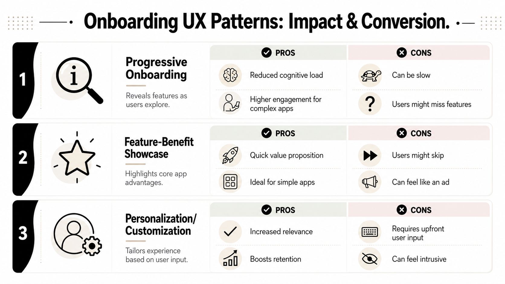
Compare the main patterns before you ship
| Pattern | Primary Goal | Pros | Cons |
|---|---|---|---|
| Progressive onboarding | Reveal complexity gradually | Lowers cognitive load, feels native in complex apps, supports feature discovery in context | Users can miss important capabilities, harder to script tightly |
| Feature-benefit showcase | Communicate value quickly | Strong for simple products, easy to localize, useful before account creation | Easy to skip, can feel promotional |
| Personalization or customization | Tailor the first experience | Increases relevance, supports segmentation, improves downstream targeting | Requires input upfront, can feel invasive if asked too early |
| Direct sign-up flow | Capture identity immediately | Useful for compliance-heavy or social graph products | High friction, weak before value is shown |
| Interactive tutorial | Teach through action | Better than passive explanation for behavior shaping | Needs careful implementation to avoid feeling rigid |
Use the right pattern for the product shape
A utility app with one obvious job can often get away with a short feature-benefit sequence followed by an immediate task. A multiplayer game usually needs interactive onboarding because controls, reward loops, and pacing are part of the product itself. A finance or health app may need some front-loaded setup, but even then the team should ask whether every question is required now or merely useful later.
Progressive onboarding works well when the interface would otherwise overwhelm the user. It lets the product teach itself in moments. Feature-benefit showcases work when the product promise is easy to understand and the user mainly needs motivation, not instruction.
Personalization sits in the middle. It can make the first session feel relevant, but only if the questions are few, clear, and visibly tied to a better experience. If the user can't tell what they get in return, the flow starts to feel like data collection.
Skip any onboarding question that only helps your team. Keep the questions that clearly improve the user's next screen.
Favor interaction over explanation
There are a few patterns that consistently remove friction. UserGuiding's onboarding statistics report that one-click social login produces a 60% higher onboarding completion rate than traditional multi-step registration, and interactive flows with gamified progress bars achieve 50% higher completion rates than static tutorials.
Those numbers line up with what most product teams see in practice. Users don't resist onboarding because they hate guidance. They resist delay.
Use these decisions as a rule set:
- Prefer one-tap identity paths when account creation is necessary.
- Add progress feedback when the flow has multiple steps. Even a simple step counter reduces uncertainty.
- Replace passive slides with one action. Ask the user to do one meaningful thing inside the app.
- Give users a way around forced commitment. "Skip," "Not now," and "Explore first" protect momentum.
If you're testing alternatives, user testing for apps is often more useful than internal opinion. Teams usually discover the same thing. What felt "clear" in a design review often feels slow on a real device in a real first session.
Implementing Your Flow Across Platforms
Implementation determines whether onboarding remains a product lever or becomes release debt.
A hard-coded onboarding flow can look fine in a sprint demo. Then reality hits. Copy changes need engineering time. Localization updates require rebuilds. A new paywall branch has to wait for App Store review. Android diverges from iOS. React Native and Flutter teams maintain separate edge-case logic. Unity and Unreal teams build one-off UI layers that nobody wants to revisit.
Hard-coded flows versus remote flows
Hard-coding still has a place. If your onboarding depends on tightly coupled native device APIs, unusual rendering constraints, or game-specific logic that must live inside the client, native implementation may be the right base. Swift, Kotlin, React Native, Flutter, Unity, and Unreal can all deliver polished onboarding if the scope is stable.
The problem is that onboarding scope usually isn't stable.
Here is the practical comparison:
| Approach | Best for | Main upside | Main downside |
|---|---|---|---|
| Hard-coded native or app-layer flow | Stable flows, deep platform-specific logic, highly custom transitions | Full control over behavior and rendering | Slow iteration, release dependency, engineering bottlenecks |
| Remote-configured flow | Fast experiments, copy changes, segmentation, monetization branches | Product and growth teams can iterate quickly | Requires strong runtime architecture and guardrails |
| Hybrid model | Most serious mobile teams | Native foundations with remotely controlled content and logic | More upfront planning |
Build onboarding like a runtime feature
The more effective model is usually hybrid. Keep the pieces that need app-level control in code. Move the sequencing, copy, branching logic, targeting, and experiment configuration into a remote layer.
That changes how teams work:
- Designers can refine order and messaging without reopening implementation tickets.
- Growth teams can test variants for paid traffic, organic users, or reactivation cohorts.
- Product managers can align onboarding, feature announcements, and paywalls inside one journey.
- Game teams can pair first-session tutorials with liveops moments, offers, and return incentives.
- Engineers can focus on runtime quality, event integrity, and platform-specific capabilities instead of rebuilding screens every week.
AI-native platforms have become useful. The value isn't "AI" as a slogan. The value is shortening the loop between idea, build, experiment, and analysis. A modern platform should let teams ship onboarding, surveys, feature announcements, retention offers, and paywalls as connected in-app experiences, not isolated campaigns.
A strong platform also needs to work across the actual mobile stack. That means native iOS and Android, plus React Native and Flutter for cross-platform apps, and Unity or Unreal for game studios that need onboarding to feel like part of the game rather than a web overlay pasted on top.
Your architecture should let the team change onboarding logic this week, not next release cycle.
Provider-agnostic beats stack lock-in
One implementation choice matters more over time than teams expect. Don't tie onboarding to a single monetization or analytics vendor unless you're comfortable rebuilding the flow later.
Provider-agnostic infrastructure gives teams room to evolve. It can sit alongside existing analytics tools, billing systems, entitlement logic, and event pipelines. That matters if your app already uses StoreKit, Google Play Billing, RevenueCat, Superwall, in-house experiments, or game backend services. It also matters if paywalls are only one part of the user journey and you need onboarding to coordinate with trials, subscription state, content access, or progression gates.
If you're evaluating runtime models, server-driven app UI is the right architectural lens. It forces the team to think about what belongs in code, what can be configured remotely, and how to preserve native feel while still moving fast.
Measuring Success with the Right KPIs and Analytics
A completion metric on its own can mislead a team. Users can finish onboarding and still fail to understand the app. They can also skip half the flow and become great retained users.
Measure onboarding as a sequence tied to activation, not as a slideshow funnel.
Start with this visual frame for the dashboard your team checks every week.
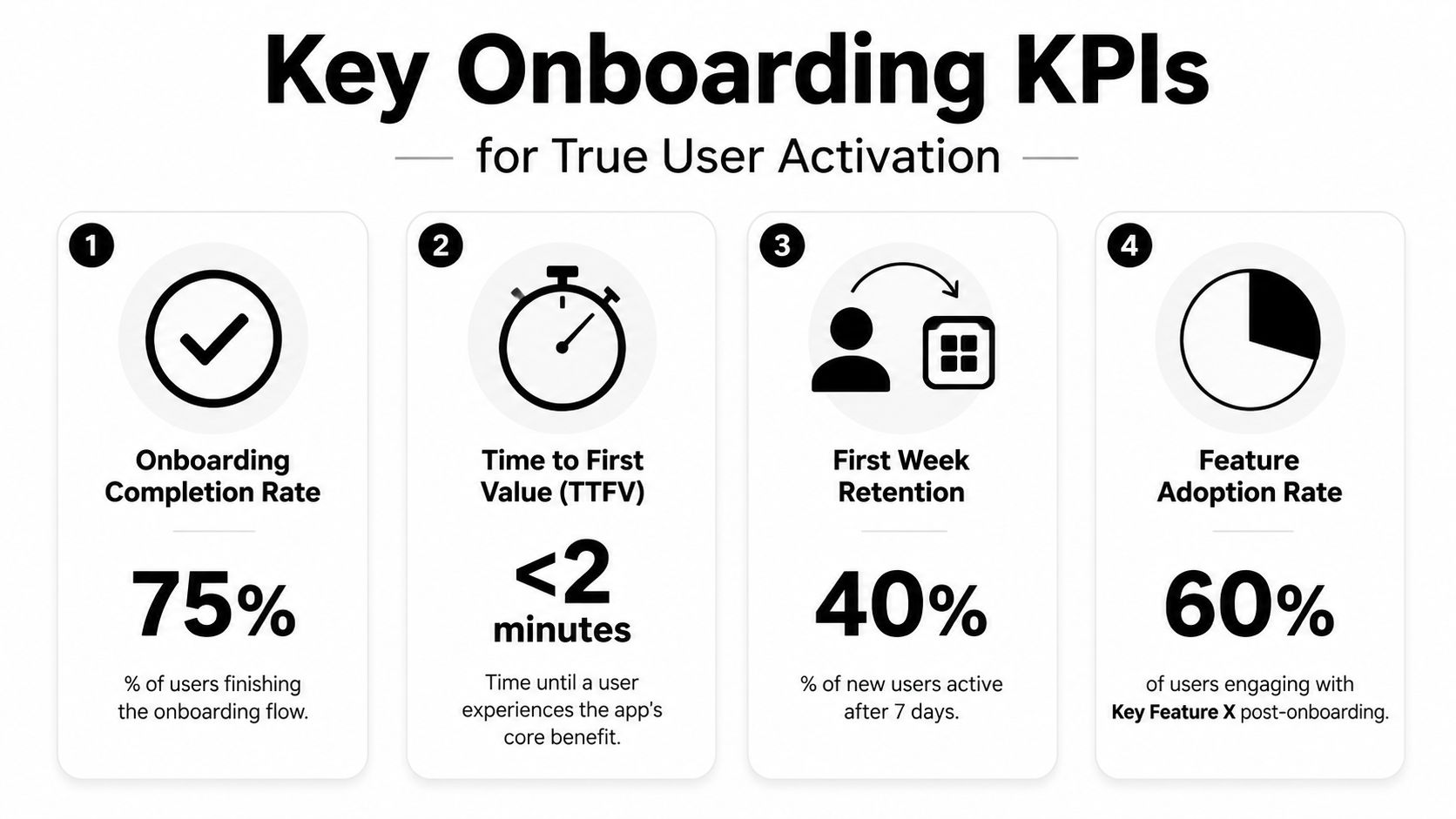
Track the events that explain behavior
The instrumentation should answer one question. Where do users stop making progress toward value?
A practical event model usually includes:
- Flow start: The first onboarding screen or welcome state is shown.
- Step completion: Each important step is completed, skipped, or abandoned.
- Core action reached: The user performs the activation behavior.
- Permission outcome: Prompt shown, accepted, denied, deferred.
- Monetization milestone: Trial viewed, paywall shown, purchase started, entitlement granted.
- Retention checkpoints: Return on Day 1, Day 7, and Day 30.
That model works across apps and games. The event names differ, but the logic doesn't.
Use platform-specific baselines carefully
Platform behavior isn't identical. VWO's mobile onboarding benchmark data reports Day 1 retention of 25.6% on iOS versus 22.6% on Android, and says that replacing static walkthroughs with interactive tutorials focused on one core action increases FTUE completion rates by about 15% over passive explanations.
That doesn't mean iOS is "better" and Android is "worse." It means your analysis should be segmented by platform before anyone reaches for a redesign.
A few examples:
| KPI | What it reveals | Common mistake |
|---|---|---|
| Time to first value | Whether users reach benefit quickly | Measuring only total session time |
| Activation rate | Whether onboarding produces meaningful action | Confusing it with screen completion |
| Step drop-off | Where friction lives | Tracking only final exits |
| Day 1 and Day 7 retention | Whether first-session success translates into return behavior | Reviewing retention without onboarding cohorts |
This is also where media, copy, and interaction choices become measurable. If a tutorial gets more starts but fewer core actions, it isn't helping. If a shorter flow lowers completion but improves activation and Day 7 retention, that may still be the right move.
The video below gives a useful product lens on what teams should measure inside first-run experience analysis.
The best onboarding dashboard doesn't just say users dropped. It shows which prompt, branch, or request caused the drop.
Advanced Onboarding Techniques and Experimentation
Onboarding that ships once and stays unchanged usually gets worse over time, even if the original flow was solid. Acquisition channels change. Product scope expands. New paywalls, offers, features, and entitlement rules appear. The old first-run path starts explaining yesterday's app.
Teams should treat onboarding as a permanent experimentation surface.
Personalization should be tied to intent
The strongest personalization doesn't mean asking users twenty questions. It means using a small amount of context to shorten the path to relevance.
That context can come from user goals, campaign source, app section entered first, game mode selected, content preference, or subscription state. The point is to branch only when the branch changes what the user sees next.
Dots Mobile's onboarding benchmarks report that apps with well-designed onboarding achieve Day 1 retention of 40% to 60%, while poorly executed flows fall below 25%. The same source says apps that personalize onboarding based on user goals increase trial starts by 8.5% and paying conversions by 17%.
Those are strong reasons to stop treating every new install the same.
Test structure, not just button copy
Many teams say they're experimenting when they're really just swapping headlines. That can help, but the bigger wins usually come from testing structure:
- whether the user sees value before login
- whether the paywall appears before or after a personalized result
- whether a tutorial is passive or interactive
- whether the first question segments by goal, skill level, or intent
- whether reactivated users should skip the full onboarding path
For game studios, this often extends beyond classic onboarding. The same logic applies to tutorial pacing, starter bundles, liveops moments, and first-purchase offers. For content and subscription apps, it applies to article previews, registration walls, free trial sequencing, and entitlement-aware messaging.
A useful experimentation setup should support more than A/B tests. It should let teams compare branches, target cohorts, inspect funnel differences, and understand the downstream effect on trial starts, purchases, and retention. If you're refining that system, A/B testing for mobile apps is a good starting point.
Keep paywalls inside the journey, not bolted onto it
Paywalls matter, but they shouldn't hijack the whole conversation. They are one important use case inside onboarding, not the entire onboarding strategy.
A paywall performs better when it appears as part of a coherent sequence. The user sees value, understands the upgrade, and then receives an offer matched to context. That same design discipline applies to feature announcements, upsells, loyalty rewards, and win-back moments. The user experiences one journey, not a stack of unrelated modals owned by different teams.
Common Pitfalls and Future-Proofing Your Onboarding
Teams rarely break onboarding with one obviously bad decision. They break it with a series of locally rational ones. Marketing wants registration for lifecycle campaigns. CRM wants more fields. Growth wants the paywall earlier. Engineering hard-codes the flow to hit a launch date. Each request makes sense on its own. The combined result is a first-run experience that asks for commitment before it has earned trust.
That pattern shows up across categories. In subscription apps, users hit forms, permissions, and monetization logic before they reach a useful outcome. In games, tutorial logic, starter offers, and event triggers get stitched together by different systems and drift out of sync. In both cases, onboarding stops behaving like one product surface and starts behaving like a queue of stakeholder demands.
The mistakes that do the most damage
A few failure modes come up repeatedly in production:
- Front-loaded forms: Teams collect account data, preferences, or profile details before the user gets a meaningful result. That lowers completion rates and also pollutes downstream data with low-intent signups.
- Permission prompts without timing or context: Push, tracking, contacts, microphone, camera, or location requests appear before the user understands why access matters. On iOS especially, a bad first prompt can permanently reduce the value of that permission slot.
- Static feature tours replacing product experience: Slides explain what the app can do, but the user never reaches the moment where the value becomes obvious through use.
- One path for every user type: New users, reactivated users, subscribers, anonymous users, and users restoring purchases often get forced through the same flow, even though their jobs are different.
- Hard-coded orchestration: Copy, sequencing, eligibility rules, and experiment logic live inside app releases. Small changes wait on QA, store review, and engineering bandwidth, so weak onboarding stays in market longer than it should.
The hard-coded issue is the one teams underestimate.
If every onboarding change requires an iOS release, an Android release, regression testing in React Native or Flutter wrappers, and custom handling inside Unity or Unreal builds, iteration speed collapses. Product learns slowly. Engineering starts protecting the code path from change. The onboarding experience then lags behind pricing changes, feature launches, entitlement rules, and retention campaigns.
Future-proof the stack, not just the screens
Good onboarding architecture supports change across the full lifecycle. Design defines the journey. Implementation respects platform constraints. Analytics tracks the same intent across clients. Remote configuration lets the team update sequencing without rebuilding the app every time a hypothesis changes.
That usually requires a few concrete decisions:
| Need | Future-proof approach |
|---|---|
| Analytics continuity | Define onboarding events once and map them cleanly into your existing analytics stack |
| Monetization flexibility | Keep billing, subscription state, and entitlements compatible with native stores and current providers |
| Cross-platform consistency | Share decision logic across iOS, Android, React Native, Flutter, Unity, and Unreal, even if presentation differs by client |
| Faster iteration | Move copy, ordering, gating rules, and experiments into remote config or a managed journey layer where appropriate |
Provider-agnostic infrastructure is often the safer bet over time. Teams can keep the analytics tools, billing systems, subscription providers, and internal services they already trust, instead of rebuilding around a vendor's closed stack. That matters for native apps using StoreKit or Google Play Billing. It also matters for studios and larger product teams that already have entitlement logic, backend identity, or LiveOps tooling in place.
AI-native tooling can help here, but only if it reduces operational drag instead of hiding it. The useful version is a system that helps teams generate variants, ship targeted in-app flows, inspect cohort performance, and update journeys remotely while preserving event quality and entitlement accuracy. The wrong version creates another silo, with its own rules, naming, and reporting.
Build onboarding so it can change as fast as the rest of the product.
Mobile app onboarding performs best when teams treat it as a living feature with owners, instrumentation, release discipline, and room for iteration across platforms. Otherwise it turns into expensive UI that looks polished in design review and underperforms in production.
Nuxie helps mobile and game teams treat onboarding as a living in-app product surface instead of a one-time build. It combines AI-native in-app experience design, experimentation, analytics, billing, entitlement infrastructure, and growth tooling in one provider-agnostic platform for iOS, Android, React Native, Flutter, Unity, and Unreal. Teams use it for onboarding flows, surveys, feature announcements, retention moments, and paywalls, while keeping flexibility with existing tools and without a revenue-share fee on billing or entitlement data. Explore Nuxie.