10 In-App Messaging Best Practices for 2026
Master the 10 in-app messaging best practices for mobile apps and games. Drive growth with actionable tips on personalization, timing, UX, and A/B testing.
In-app messaging is often still treated like a timed pop-up system. That's the wrong model. A message that appears because a marketer scheduled it for Tuesday at 2 p.m. usually lands with no context, no urgency, and no respect for what the user is trying to do.
That's why so much in-app messaging gets dismissed as noise. It interrupts checkout, covers key UI, repeats the same offer to power users and first-session users, and measures success with shallow metrics. If your team ships messages this way, users learn to close them on reflex.
The better model is product-native intervention. In-app messaging works when it behaves like part of the app, not a layer pasted on top of it. Used well, it can guide onboarding, teach features, collect zero-party preferences, recover conversion moments, support monetization, and coordinate with push, email, and SMS. One industry summary reports a 75% impression rate for in-app messaging, with visibility described as 45 times higher than email and nearly 3 times higher than push notifications. That advantage matters only if the message is relevant.
For mobile product, growth, and game teams, the practical challenge isn't whether to use in-app messaging. It's how to build it so it's fast to ship, safe to experiment on, measurable, and consistent across iOS, Android, React Native, Flutter, Unity, and Unreal. That usually means moving beyond hardcoded prompts and into a runtime that can target, render, test, and analyze experiences without waiting for app releases.
These are the in-app messaging best practices that hold up in production.
1. Implement Contextual and Behavioral Triggering
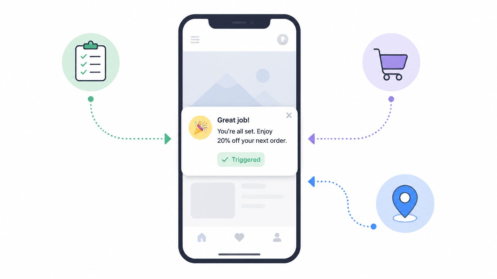
A generic timer is the weakest trigger in your stack. If a user has just completed a tutorial, abandoned a cart, hit a rate limit, or finished a successful raid, you already have better context than “session started 30 seconds ago.”
Behavioral triggering beats scheduled messaging because it aligns with intent. A travel app can surface a saved-search prompt after sustained browsing. A language app can warn about a streak risk near the end of the day. A B2B app can show an upgrade message exactly when a team reaches a usage ceiling. In games, a battle pass prompt usually performs better after a win than after a loss because the player is already in a reward mindset.
What to trigger on
Start with moments that already signal interest or friction:
- Completion events: Finished onboarding step, completed first workout, won a match, read an article.
- Constraint events: Hit usage cap, reached paywall threshold, attempted premium action without entitlement.
- Drop-off signals: Exited checkout, stalled in signup, repeated the same failed action.
- Discovery moments: Entered a feature area for the first time, opened a menu with a new capability.
If your stack supports on-device evaluation, use it. You don't need a round trip to the server just to decide whether a local banner or modal should render. That keeps delivery fast and reduces brittle dependencies during the session.
Practical rule: Trigger on user state, app state, and business state together. Behavior alone isn't enough if the user is offline, already subscribed, or inside a critical flow.
Teams usually get this wrong by stacking triggers. A user completes a task and suddenly sees a rating prompt, a feature card, and a discount modal. Put a message queue and suppression logic in front of delivery. Good triggering includes deciding what not to show.
If you're defining cohorts for this, behavioral segmentation for mobile apps is the useful foundation. It gives product and growth teams a shared way to express rules like “engaged but not converted” or “finished tutorial but never used feature X” without reducing everything to static demographics.
2. Design Lightweight, Native-Feeling User Experiences
Users don't care that a message came from your growth system. They care whether it feels like part of the app or a cheap interruption. If it looks bolted on, loads late, ignores dark mode, or blocks the only visible action on a small screen, it damages trust fast.
The best in-app messaging often doesn't announce itself as messaging. Slack-style toasts, bottom sheets, anchored tooltips, embedded cards, and subtle banners usually outperform heavy overlays for routine education and feature discovery. Save full-screen takeovers for moments with real stakes, like onboarding choices, legal acceptance, or a high-intent paywall.
Match the platform, not your design file
iOS and Android users notice when you ignore platform conventions. The same applies to cross-platform apps built in React Native or Flutter and games running in Unity or Unreal. The rendering layer can be shared, but the interaction model still has to respect the device.
A few rules hold up across teams:
- Respect motion preferences: Don't force animated entrances if the user has reduced motion enabled.
- Respect typography settings: Dynamic type and larger font settings should not break the CTA or hide the close affordance.
- Respect screen context: A modal that works on a tablet may be intolerable on a smaller phone during one-handed use.
Messages also need to load like first-class UI. If your runtime can deliver remote layouts and assets without an app update, use that flexibility carefully. Rich animation support is useful, especially with Rive, but only when performance stays smooth on mid-range Android devices and older iPhones.
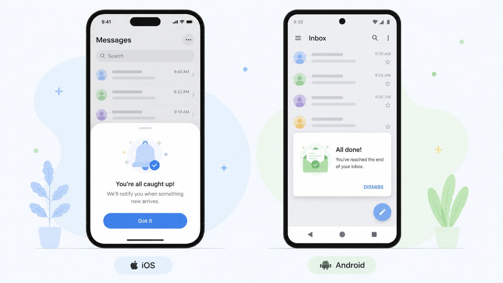
A native-feeling system also needs consistent design tokens. If the product team uses one radius, one spacing scale, and one set of semantic colors, your in-app messages should inherit them. Nuxie is useful here because teams can ship remote experiences that still follow app styling across iOS, Android, React Native, Flutter, Unity, and Unreal instead of maintaining separate ad hoc prompt systems in each client.
What doesn't work is the “growth overlay” look. Different fonts. Wrong button treatment. Generic close icon. Awkward safe-area handling. Users notice.
3. Personalize Messages Based on User Segments and Lifecycle Stage
The fastest way to lower relevance is to send the same message to everyone. A day-one user needs orientation. An activated user needs discovery. A dormant user needs a reason to come back. A paying subscriber needs recognition and utility, not the same upgrade pitch you show free users.
Segmentation is one of the core recommendations in industry guidance on in-app messaging best practices, alongside relevant copy and testing, because visibility only matters when the message fits the audience. That's especially true in mobile products with mixed user intent, such as news apps, fintech apps, marketplaces, and games.
Build segments that product and growth can both use
Useful segments combine multiple signals rather than one label. “High value” is vague. “Completed KYC, used card controls twice, and viewed premium analytics” is operational.
A practical segmentation model often includes:
- Lifecycle stage: New, activated, habitual, at-risk, resurrected
- Behavioral depth: Browsed, tried, repeated, completed, purchased
- Commercial state: Free, trial, lapsed, subscribed, refunded
- Engagement pattern: Daily, weekend-only, bursty, declining
A few examples make the point. A news app can show a premium offer after a loyal reader repeatedly hits article limits, while a first-session visitor sees a registration prompt instead. A mobile game can reserve cosmetic offers for engaged players and use early sessions for progression guidance. A fintech app can hold advanced feature education until the user has completed identity checks and made an initial transaction.
Relevance comes from combining behavior with business state. A user who wants a feature but can't access it is different from a user who never showed interest.
Provider-agnostic tooling is particularly important. If your entitlements live in one system, messaging in another, analytics in a third, and experiments in a fourth, segmentation drifts. Teams spend more time reconciling states than improving campaigns. A platform like Nuxie can sit alongside existing providers and unify these inputs without forcing a full rip-and-replace, which is often the practical path for mobile teams with live products.
4. Optimize Message Timing and Frequency Carefully
Bad timing can ruin a good message. So can repetition. Teams usually notice this only after users start dismissing everything or support starts hearing complaints about constant interruptions.
Frequency control isn't glamorous, but it's one of the most impactful parts of an in-app system. If a user sees three promotional prompts in one session, your fourth message could be useful and still get ignored. That's learned dismissal.
Set priority and suppression rules
Not every message deserves equal treatment. Security alerts, purchase confirmations, and entitlement recovery deserve immediate delivery. Promotional upsells do not. Treat timing as a ranking problem, not just a trigger problem.
A simple hierarchy helps:
- Critical: Purchase issues, account safety, blocking workflow errors
- Important: Onboarding guidance, feature education tied to current action
- Promotional: Upgrades, offers, event announcements
- Research: Surveys, preference collection, qualitative feedback asks
Then add suppression logic. Don't show a survey in checkout. Don't show an upgrade prompt while a game session is actively running. Don't show a promo to a user who just dismissed a similar message.
Independent guidance from Airship also points to orchestration across in-app, email, push, and SMS, plus preference centers and in-app surveys to collect zero-party data and reduce fatigue. That matters because median push opt-in rates are about 51%, which leaves in-app messaging able to reach the full active audience while preference data improves targeting.
The practical takeaway is simple. Track frequency at the user level across channels, not just inside one tool. If push already carried the message, in-app may need to reinforce or continue the flow, not repeat the same line with a different button.
5. Implement Comprehensive Experimentation and A/B Testing
Most teams are too confident about copy, timing, and layout. Then they run a real test and find out the “obvious winner” loses. That's normal. In-app messaging is full of local truths that don't generalize across segments, platforms, or products.
Testing should cover more than button color. The meaningful variables are usually message timing, audience logic, value proposition, screen format, and what happens after the click. In subscription apps, paywall timing often matters as much as paywall design. In games, reward framing can matter more than visual polish. In utility apps, a small inline card can beat a modal because it preserves task flow.
What to test first
Start with one primary hypothesis per test. Keep the design disciplined enough that you can explain the result later.
Good first tests include:
- Trigger timing: immediately after event vs. after second repetition
- Format choice: embedded card vs. modal vs. bottom sheet
- Copy framing: benefit-led vs. action-led CTA
- Audience boundary: all active users vs. users who crossed a meaningful threshold
- Offer sequence: educate first vs. paywall first
Industry guidance consistently emphasizes segmentation, concise copy, and A/B testing together because isolated tweaks don't move much if targeting is still wrong. Remote experimentation offers significant advantages here. If your mobile team needs a release just to test headline variants or reorder a flow, you won't run enough tests.
For teams building a repeatable process, A/B testing for mobile apps is the operational mindset to adopt. The goal isn't to run one-off experiments. It's to create a loop where product, growth, and data teams can ship variants, read downstream impact, and turn winners into defaults without waiting on store approvals.
Don't stop at clickthrough. Measure what happened after interaction. Did the user adopt the feature, subscribe, finish onboarding, or return later?
6. Integrate In-App Messaging with Monetization and Billing
In-app messaging isn't just a support or onboarding layer. In many mobile apps, it is part of the monetization system. Retail benchmark-style guidance from Airship reports that retailers using in-app messaging see customers purchase 140% more frequently and achieve conversion rates up to 8x higher than standard approaches. That's why high-performing teams treat messaging as a revenue surface, not just a communication surface.
The implementation detail that matters most is state. If the app can't reliably tell who is free, trialing, subscribed, lapsed, refunded, or entitled to a specific feature, the monetization message will be wrong at exactly the worst time.
Connect the message to the purchase state
A paywall should know what the user has already seen, what they own, which store they're buying through, and whether a previous purchase is pending or interrupted. The same logic applies to upgrade cards, retention offers, consumable bundles, and battle pass moments.
Examples across app categories are straightforward:
- A news app shows a paywall after a reader reaches a content threshold.
- A fitness app offers premium plans after the user completes a workout and sees the next locked program.
- A game surfaces a battle pass or limited bundle after a successful progression moment.
- A productivity app shows an upgrade path when a free workspace hits a feature boundary.
What doesn't work is bolting a paywall tool onto a separate entitlement system and hoping the states line up. Teams end up with duplicate products, stale access checks, and analytics that disagree on who converted.
Nuxie's useful angle here is that paywalls are one use case inside a broader platform. Teams can design the pre-paywall journey, test the offer, sync billing and entitlement data, and analyze the downstream effect in one place. It can also work alongside existing tools and doesn't charge a revenue-share fee for billing or entitlement data, which matters for teams that want flexibility rather than another hard dependency.
If monetization is central to your roadmap, mobile app monetization models and implementation trade-offs are worth thinking through before you design the message layer.
7. Use Rich Media and Engaging Interactive Elements Thoughtfully
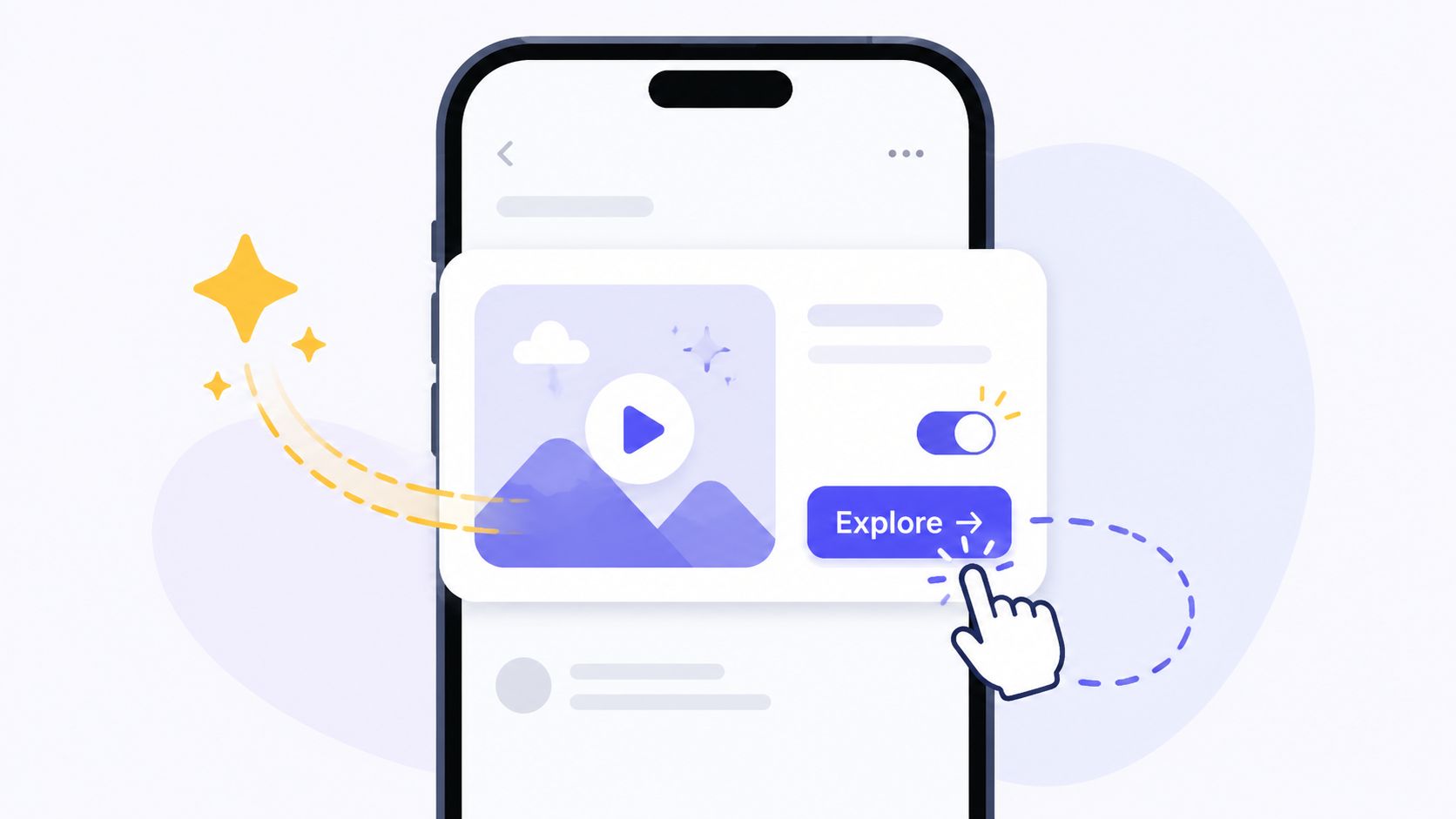
Rich media can improve clarity, especially when you're introducing a visual feature, teaching a gesture, or selling an aesthetic product like a game skin or streaming upgrade. It can also wreck load time and overwhelm the screen if you use it as decoration.
The right standard isn't “more visual.” It's “more understandable without slowing the app down.” A short animation that explains a new feature can be excellent. A heavy auto-playing video on a weak connection usually isn't.
Pick the media that matches the job
A few common use cases:
- Games: Animated reward reveals, battle pass previews, liveops event cards
- Fitness: Motion demos for form cues or premium program previews
- E-commerce: Product imagery, carousels, color or size highlights
- Banking and fintech: Lightweight visual explanations for security features or account setup
For most mobile teams, vector animation is a better default than video when the message needs motion but not full cinematic storytelling. Rive is useful because it keeps assets lightweight and scalable across different screen sizes. That matters for apps shipping across native stacks and engines, not just one UI framework.
“If the asset is larger than the message benefit, cut the asset.”
Rich media also needs fallback behavior. If the animation fails to load, the message still needs to render correctly with static content. Test on real devices with mediocre networks, low-memory conditions, and background app pressure. Fancy assets that only look good on a simulator aren't production-ready.
8. Build Analytics and Measurement Into Every Campaign
If you only track impressions and taps, you're not measuring impact. You're measuring exposure. In-app messaging should be tied to downstream business outcomes, or you'll optimize for messages that attract clicks and don't change behavior.
That means every campaign needs a clear event model before launch. Impression is one event. Dismiss is another. CTA tap, next-screen view, purchase start, purchase completion, feature use, retained return, survey completion, and entitlement change all belong in the chain when relevant.
Measure the full path
For a feature announcement, the primary question isn't whether the user opened the modal. It's whether they used the feature later. For a paywall, the actual path may be impression, interaction, checkout start, purchase success, renewal, or cancellation. For onboarding, it may be prompt exposure, step completion, and time to first meaningful action.
A practical campaign measurement setup should include:
- Control groups: Users who qualified but did not see the message
- Funnel definitions: Impression to interaction to target outcome
- Segment cuts: New vs. returning, free vs. paid, iOS vs. Android
- Lag windows: Enough time to capture delayed conversion, not just same-session response
This is one reason unified tooling helps. If your message analytics stop at the click and your revenue or product analytics live elsewhere, teams tend to celebrate shallow wins. Nuxie's provider-agnostic analytics workspace is valuable when you need campaign data, experiment results, entitlement changes, and user journey state in one workflow instead of exporting logs into a spreadsheet every week.
Good measurement also archives learnings. A campaign that lost last quarter may win later for a different segment or placement. Institutional memory matters.
9. Respect User Privacy and Provide Clear Opt-Out Mechanisms
A high-performing messaging system still fails if users don't trust it. Privacy isn't a legal afterthought here. It affects targeting quality, channel reach, and long-term retention.
The strongest practical pattern is to collect preference data directly in the app and use it carefully. If a user tells you they want release notes but not promos, or gameplay tips but not store offers, that preference is more valuable than inferring intent badly from noisy behavior.
Give users control without breaking the experience
Control doesn't have to mean a binary “all messages on or off.” It can mean scoped preferences and channel choices:
- Message categories: Promotions, product education, reminders, account issues
- Channel preferences: In-app only, push plus in-app, email for receipts only
- Frequency controls: Fewer promotional messages, no surveys, event-only updates
Airship's guidance is useful here because it connects in-app surveys and preference centers with zero-party data collection and lower notification fatigue. That's not just a compliance story. It's a targeting story. Clear preferences often outperform guessed preferences.
On-device targeting also helps reduce unnecessary data movement. For teams operating across iOS and Android, especially under stricter privacy expectations, that architecture is often cleaner than pushing every targeting decision through external identity matching. It's also more resilient for apps and games that need offline-ready behavior.
Make the settings discoverable. If users have to dig through five menus to change messaging preferences, the control is technically present and practically useless.
10. Design Coherent User Journeys Across Multiple Messaging Touchpoints
A single message rarely does all the work. Users move across screens, sessions, and channels. The job is to design a journey where each step feels connected and earns the next one.
A weak journey repeats itself. Push says “try this feature,” then in-app says the same thing, then email says it again. A strong journey advances the state. Push brings the user back. In-app explains the feature in context. A later card tracks progress. A paywall appears only if the user hits the premium boundary. A follow-up message changes based on what happened.
Orchestrate flows, not isolated campaigns
This matters in every category:
- Onboarding: Welcome survey, contextual checklist, first-win celebration, premium upsell later
- Retention: Re-entry prompt, reminder of unfinished action, targeted offer, reactivation sequence
- Games: Event teaser, quest walkthrough, reward screen, store offer, progression reminder
- Subscriptions: Feature teaser, usage milestone, paywall, trial recovery, cancellation save flow
The implementation challenge is branching logic. If the user dismisses the first message, what happens next? If they convert, which follow-ups are suppressed? If they already saw a push, should the in-app screen educate instead of repeat the CTA?
Collaborative flow tooling matters more than one-off campaign builders. Product, growth, and lifecycle teams need to see the same journey map and the same state transitions. Nuxie's flow editor is useful because teams can design onboarding quizzes, feature education, retention offers, paywalls, and other connected experiences remotely, then publish them across iOS, Android, React Native, Flutter, Unity, and Unreal without waiting for app releases.
Design the next message based on the user's last action, not your campaign calendar.
In-App Messaging: 10 Best Practices Comparison
| Strategy | Implementation Complexity (🔄) | Resource & Performance Considerations (⚡) | Expected Outcomes & Impact (⭐📊) | Ideal Use Cases & Tips (💡) |
|---|---|---|---|---|
| Implement Contextual and Behavioral Triggering | Medium–High: event tracking and real‑time logic | Moderate runtime needs; benefits from on‑device evaluation | ⭐⭐⭐⭐ 📊 Higher engagement and conversions; reduced message fatigue | Target high‑intent moments (tutorials, checkout, feature unlocks) |
| Design Lightweight, Native‑Feeling UX | Medium: platform‑specific UI work per OS | Requires per‑platform design/dev; offline rendering improves speed | ⭐⭐⭐ 📊 Improved perceived quality and retention; fewer uninstalls | Use native patterns, test on real devices, respect system settings |
| Personalize Messages by Segment & Lifecycle | High: segmentation, cohorting, predictive scoring | High data engineering and analytics effort | ⭐⭐⭐⭐ 📊 Significant relevance lift and better ROI | Lifecycle campaigns (onboarding, retention, VIP offers); combine signals |
| Optimize Message Timing & Frequency | Medium: capping, queuing, suppression rules | Moderate backend tracking across channels and timezones | ⭐⭐⭐ 📊 Reduced churn/uninstalls; higher long‑term retention | Use frequency caps, suppression during critical flows, A/B test rates |
| Implement Comprehensive Experimentation & A/B Testing | Medium: experiment infra and statistical rigor | Needs analytics, traffic and time to reach significance | ⭐⭐⭐⭐ 📊 Data‑driven improvements; possible 10–50%+ conversion gains | Define metrics, run 7–14 day tests, document learnings |
| Integrate Messaging with Monetization & Billing | High: billing integrations, entitlement and compliance | Heavy engineering and store compliance; enables faster revenue flow | ⭐⭐⭐⭐ 📊 Seamless purchases; increased conversion and accurate entitlements | Use entitlement data to personalize paywalls; test timing and tiers |
| Use Rich Media & Interactive Elements Thoughtfully | Medium–High: asset creation and optimization | Media increases payload; optimize (WebP/Rive, lazy load) for performance | ⭐⭐⭐ 📊 Higher engagement (2–5x) when well‑optimized | Prefer vector animations, short durations, provide fallbacks |
| Build Analytics & Measurement Into Every Campaign | High: event instrumentation and attribution | Significant tooling and analytics expertise required | ⭐⭐⭐⭐ 📊 True ROI visibility; enables continuous optimization | Always include control groups and track full funnels end‑to‑end |
| Respect User Privacy & Provide Clear Opt‑Out | Medium: consent flows and privacy‑first architecture | Moderate legal and engineering effort; on‑device reduces data sharing | ⭐⭐⭐ 📊 Increased trust and compliance; smaller addressable audience | Offer granular controls, respect system privacy signals (ATT, GDPR) |
| Design Coherent Journeys Across Multiple Touchpoints | High: orchestration, branching, cross‑channel sync | Requires collaborative tools and reliable data sync | ⭐⭐⭐⭐ 📊 Cohesive experience; higher funnel completion and conversion | Map goals first, use visual flow editors, test end‑to‑end on devices |
From Best Practices to Daily Practice
The hard part of in-app messaging isn't generating ideas. Personalizing, testing, and avoiding spam are recognized as essential practices. The hard part is operationalizing those habits inside a live mobile product where app releases are slow, billing state is messy, analytics are fragmented, and every extra prompt competes with the user's task.
That's why the best in-app messaging best practices don't live as copywriting tips. They live in systems design. You need event instrumentation that product and growth both trust. You need segmentation that reflects lifecycle and entitlement state, not just audience labels. You need rendering that feels native on iOS and Android, but also works in React Native, Flutter, Unity, and Unreal. You need experiments that can ship remotely and analytics that can connect a message exposure to feature adoption, retention, or purchase.
The practical shift is to stop thinking in isolated campaigns and start thinking in runtime-controlled user journeys. A tooltip, banner, paywall, survey, and retention offer shouldn't be separate programs owned by separate tools if they act on the same user state. They should be coordinated expressions of the same growth system.
That matters even more for monetization. Paywalls are important, but they're only one point in the journey. Before the paywall, users need context, value education, and the right trigger. After the paywall, they need clean billing recovery, entitlement sync, and suppression of irrelevant follow-ups. The same platform that manages the message should understand the commercial state, or teams end up debugging contradictions instead of improving conversion.
It also matters for privacy and user trust. Clear preference controls, zero-party inputs, and on-device targeting aren't nice extras anymore. They improve relevance while reducing unnecessary data movement and message fatigue. In other words, privacy-aware design and performance marketing are no longer in conflict when the system is built correctly.
If you're trying to put this into practice, don't start with a full program redesign. Start with one high-value journey. Onboarding is usually the cleanest entry point because the events are easy to define and the outcomes are visible. A monetization journey can work too if your entitlement and purchase states are already instrumented. Pick one flow, define its triggers and suppression rules, build message variants, add a control group, and measure the full downstream path. Then keep the pieces that work and remove the ones that don't.
That last part matters. In-app messaging gets better when teams are willing to delete prompts, not just add them. The winning system is rarely the loudest. It's the one that shows the fewest messages necessary to move the user forward.
Nuxie gives mobile app and game teams one place to design, test, analyze, and ship in-app experiences without app releases. If you need a provider-agnostic platform for onboarding flows, feature announcements, surveys, paywalls, retention offers, billing and entitlements, and cross-platform delivery across iOS, Android, React Native, Flutter, Unity, and Unreal, Nuxie is built for that workflow.